Shaking Up Indonesia's OTT Scene
Background
GoPlay is a OTT platform by GoJek(Indonesian SuperApp with 21+products) which is publicly available to download in whole of Indonesia. The service boasts of an array of exclusive movies and TV shows, including Indonesia‘s 2019 Academy Awards nominee Memories of My Body which was co-financed via an in-house studio the company started in 2018. It also partnered with US media outlet Vice to collaborate on original content.
Press 👉 techinasia ↗ techcrunch ↗ thenextweb ↗ reuters ↗
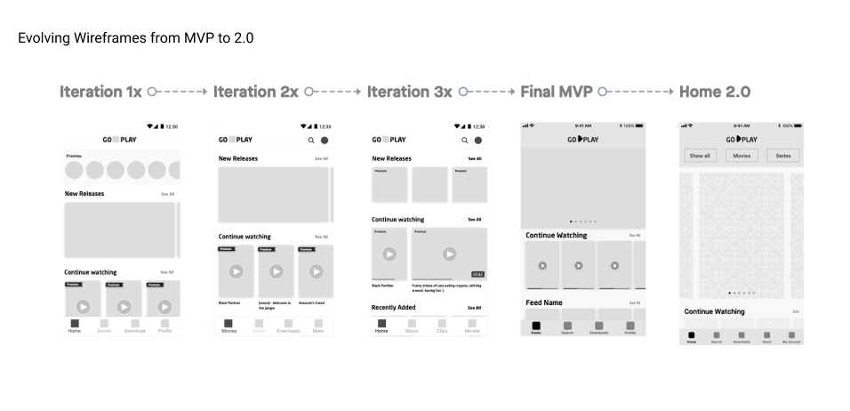
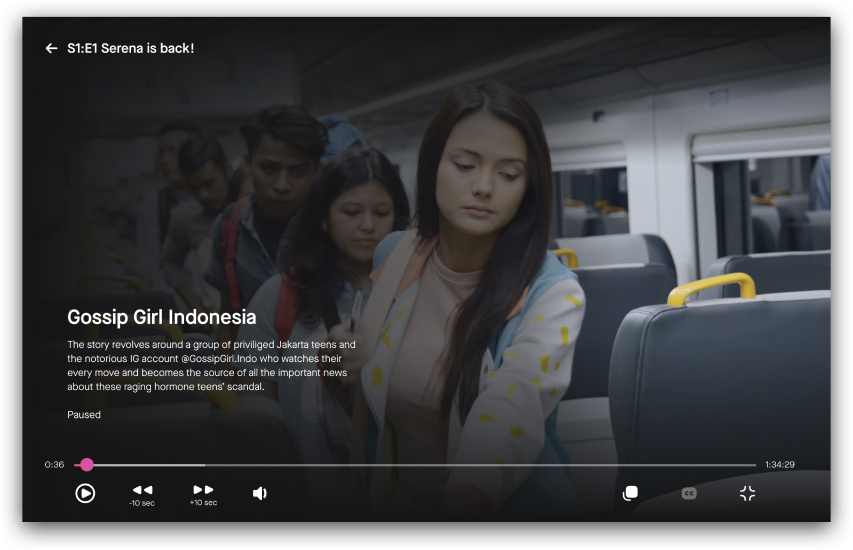
Preview of Mobile App Experience
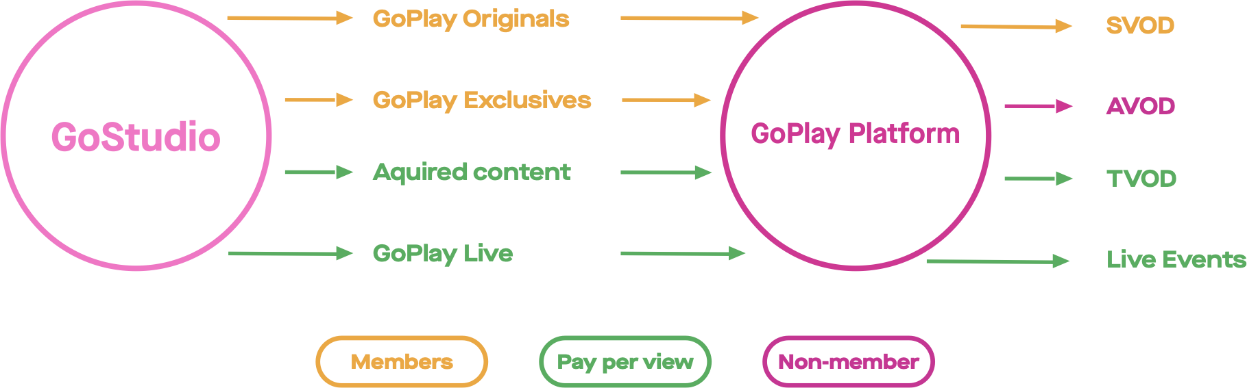
While GoStudio produced original documentaries, short films, and feature-length works from indi-filmmakers, the Product team built ios, android, web and Smart TV platform to showcase the content with SVOD, AVOD and TVOD models all by its v1.
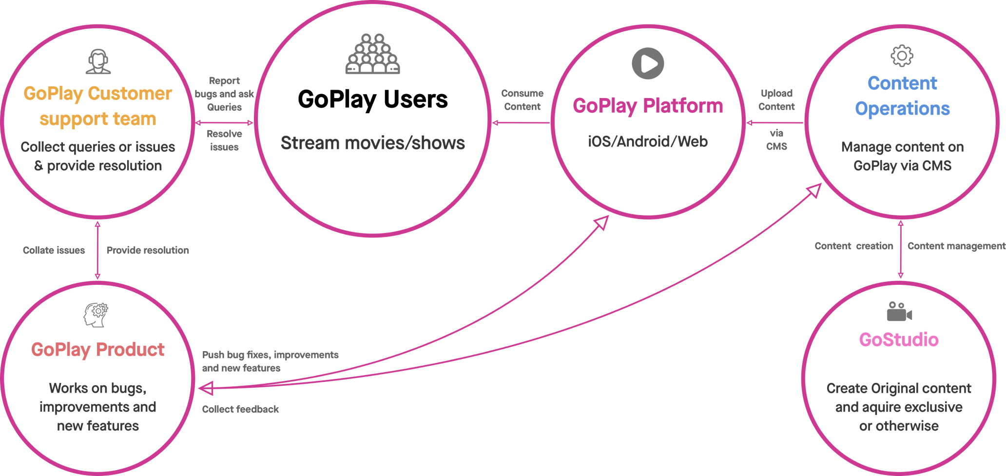
High level flow diagram
My Role & Process
I joined GoPlay at its MVP stage as Product design lead overlooking design across all GoPlay platforms. I managed 2 designers(UX in IC role) directly while I was collaborating with researchers, Writers and Illustrators from the respective Central teams. Engineering running themselves in 3-week sprints, I ensured that Designs are being tested and delivered at-least 1 sprint ahead for us to then continuously track.
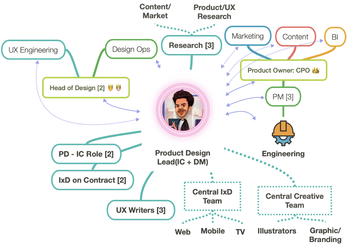
Across Org. collaboration(My POV)
At Gojek, we have a standard process that's flexible dpending on the type of product and team.
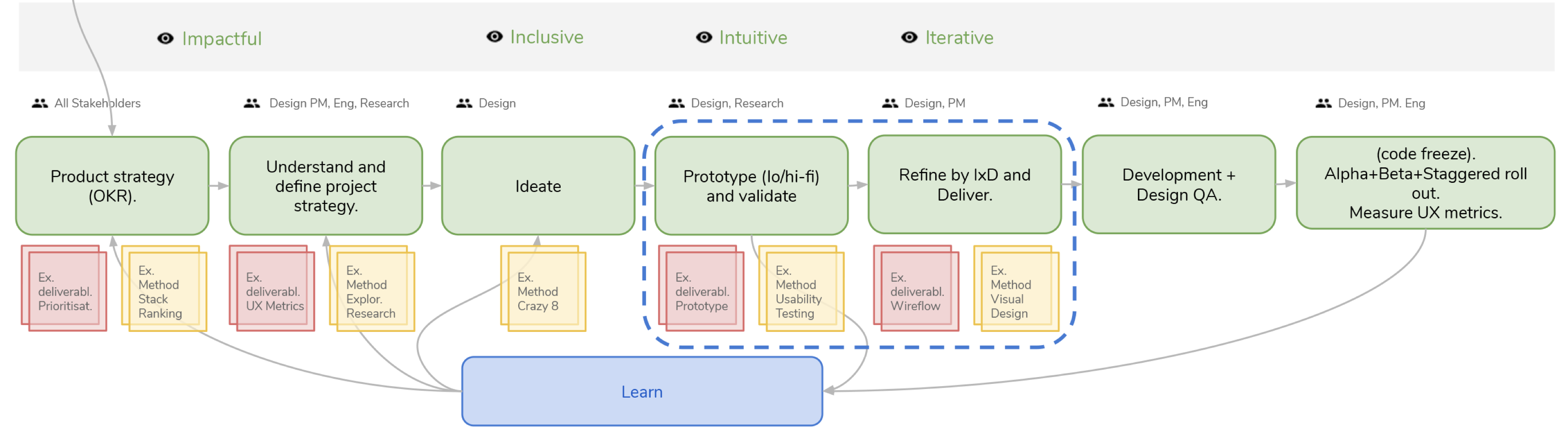
Design Process
Lets get a few things right 1st
So GoPlay at its MVP stage lacked multiple things including- documentation, IA maps, Flows, Wireframes and wasn't compliant to the Ashpalt(now Aloha) design language system. Once all the potential work was estimated, it was clear enough that its not a solo designers job to maintain design across 3 platforms. That's when we made our 1st hire and kept it scaling as the product grew.
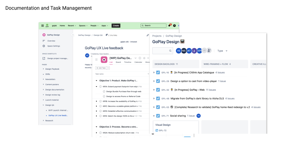
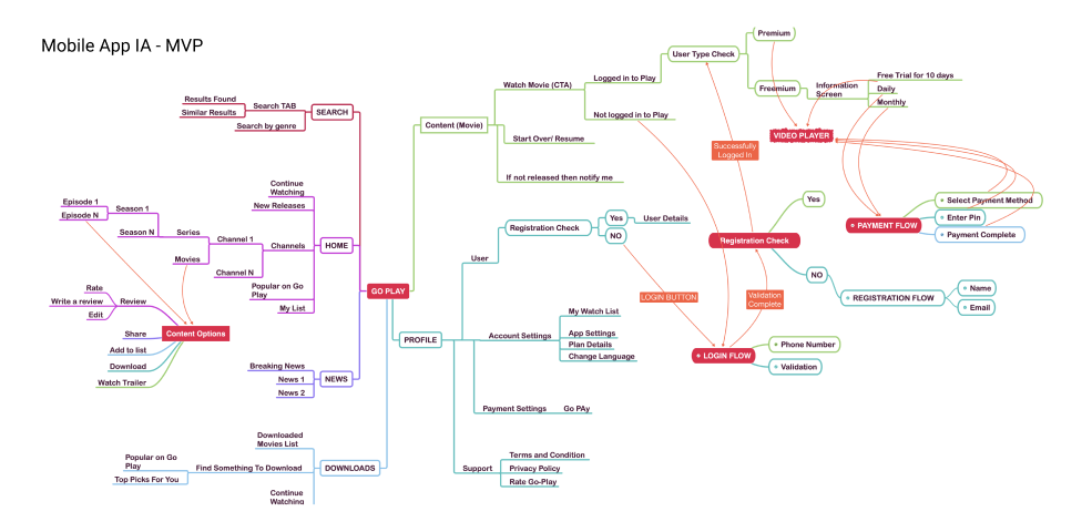
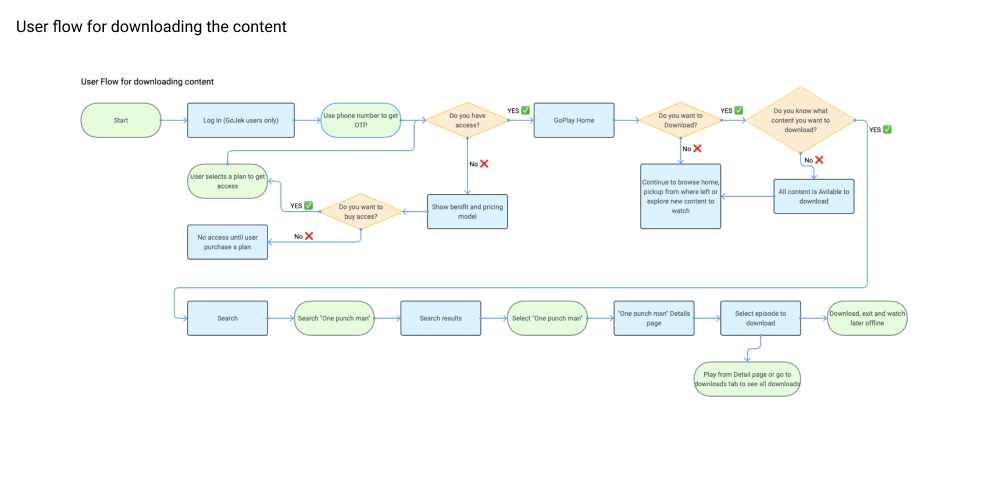
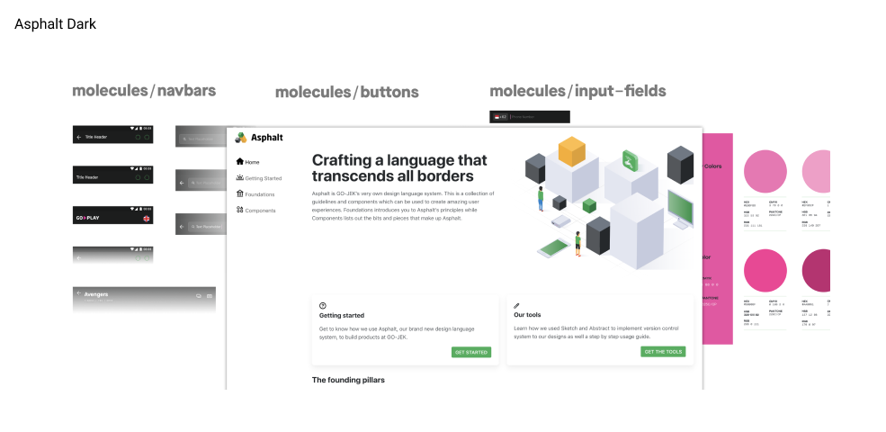
And here it begins- I started with embedding task management tools like Asana, Documenting design decisions on confluence, reviews, newsletters, etc. I also used the technical flow diagrams from dev teams to deisgn User-flows and Information architecture, using this I also created wireframes of the MVP to further iterate on. And lastly the DLS work- Theming existing light DLS to Dark mode with GoPlay's hot-pink color scheme, making typography compatible and converting essential components to dark-mode for mobile and web
Get acquainted with our target user
Meet Bayu.
Bayu is hopeful and ambitious. It's her 1st job, and she is learning more and more about her new career. Her daily-commute between cities is time-consuming. While she socialises, it's often that everyone talks about their favourite show they currently watching. She cook’s her own food and enjoys watching show’s that interests her, often times recommended by friends.
Goals—
- Looking for new inspirational/fun content every day.
- Avid English speaker, subtitles are must have.
Pain points—
- Saturated local content with good quality.
- Inability to self decided, What to watch?
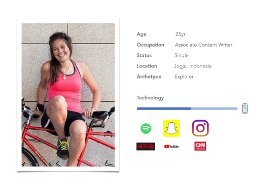
Proto Persona
Design Challenge
GoPlay MVP was created based on business requirement without considering insights from the end-user making it very hard to use. As a result the task performed by users are time consuming and unnecessarily prolonged.
Problem statement 🤔
The search for relevant content is often a failure and is an unfortunate consequence of bad content discovery experiences.
The Solution 💡
Apply an evidence-based methodology that involves end-users throughout the design process in order to design a solution that delights user.
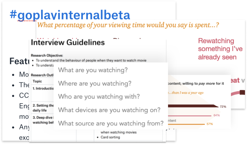
Initial Research
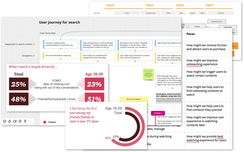
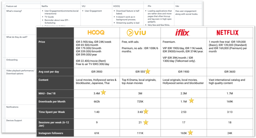
Goal was to inform Product, Content and Market strategy post MVP launch Listening and understanding our users aspiration from their feedback to get some clue about their preferences and perception about GoPlay. We did competitive analysis, user-interviews, run survey, captured user feedbacks from social media and App Stores to collect quantitative and qualitative data.
UX Analysis
Some Key findings
Browsing is a key (often overlooked) component of content discovery: Consumers spend, on average, 42% of their time browsing through content because they don’t know what they want to watch. 37% of respondents say they don’t want to waste their time on starting a new show. Users tend to primarily(IF) continue watching what they have left.
Personalised recommendations are not top-of-mind and often not trusted: 60% of respondents believe personalized recommendations reflect shows the service is trying to promote, not necessarily shows they think they’ll like.
Don’t just tell me “what.” Tell my “why.” Consumers are smart. Today’s audience wants to understand the “why” behind the what. Why does the show have a high rating? What are critics saying? How likely am I to enjoy this show? How did others like me rate it? Also the existing IA may not be the best way to represent details of catalog that would promote most users to watch content.
Patience has dwindled: 74% of respondents know within a few seconds if they’ll like a piece of content. Shorter trailers are preferred since it makes them curious about the episode.
Ideation and Prioritisation
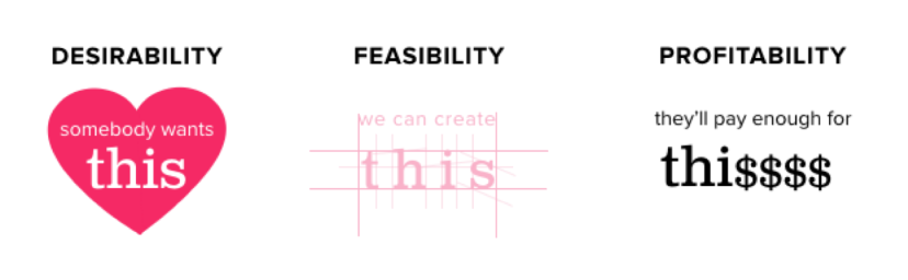
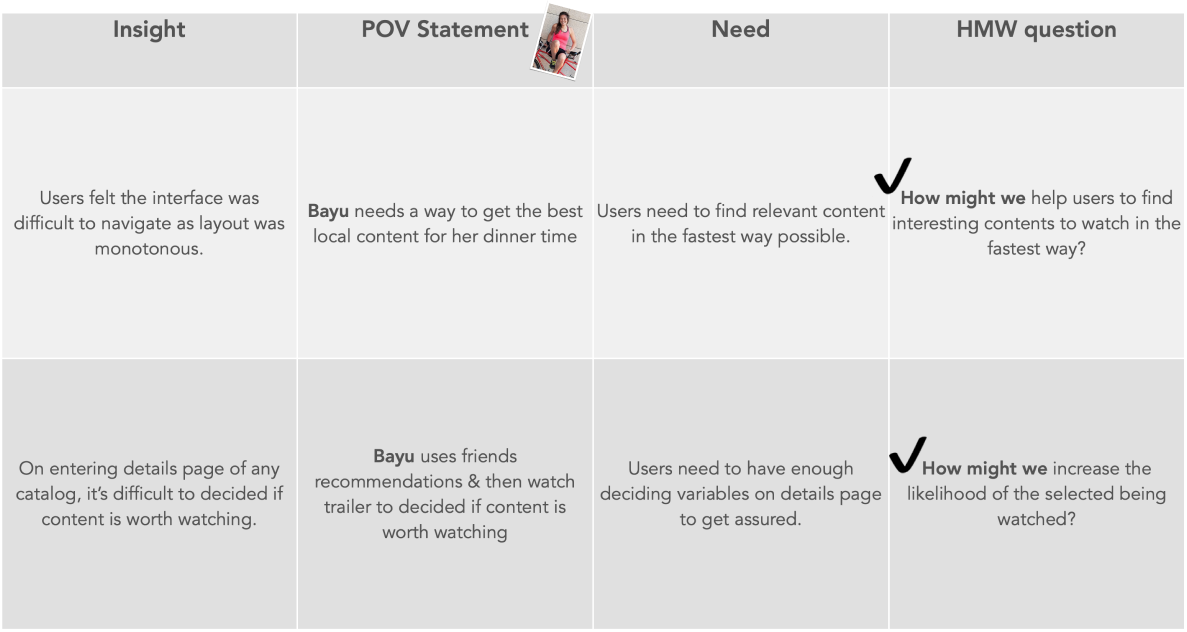
With all the research in hand now its time for synthesis and prioratisation. Applying design thinking framework here, to identify multiple HMW's and run them through a prioratisation framework of- Desirability, feasibility and profitability as deciding factors.
Our primary objective was to increase MAU, and total minutes watched by at least 25% per quater.
User Job Stories
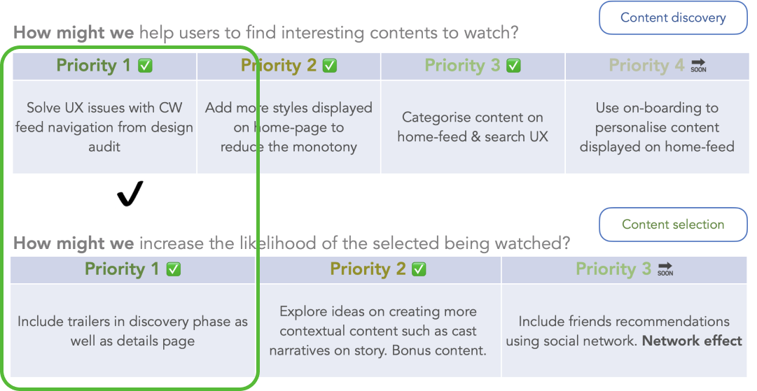
Most desirable? Most Feasible? Most Profitable?
Iterating Discovery & Navigation
How do I approach solving design problems? It is through developing a hypothesis and running it through experimentation to conclude results. I run these experiments in various formats, listing down top 3 approach below along with respective topic of research discussed further—
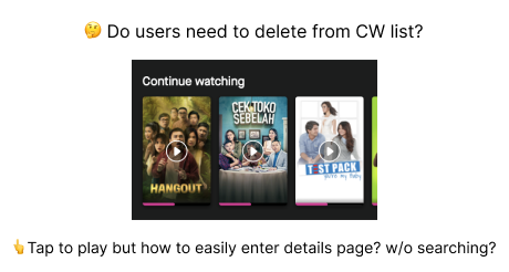
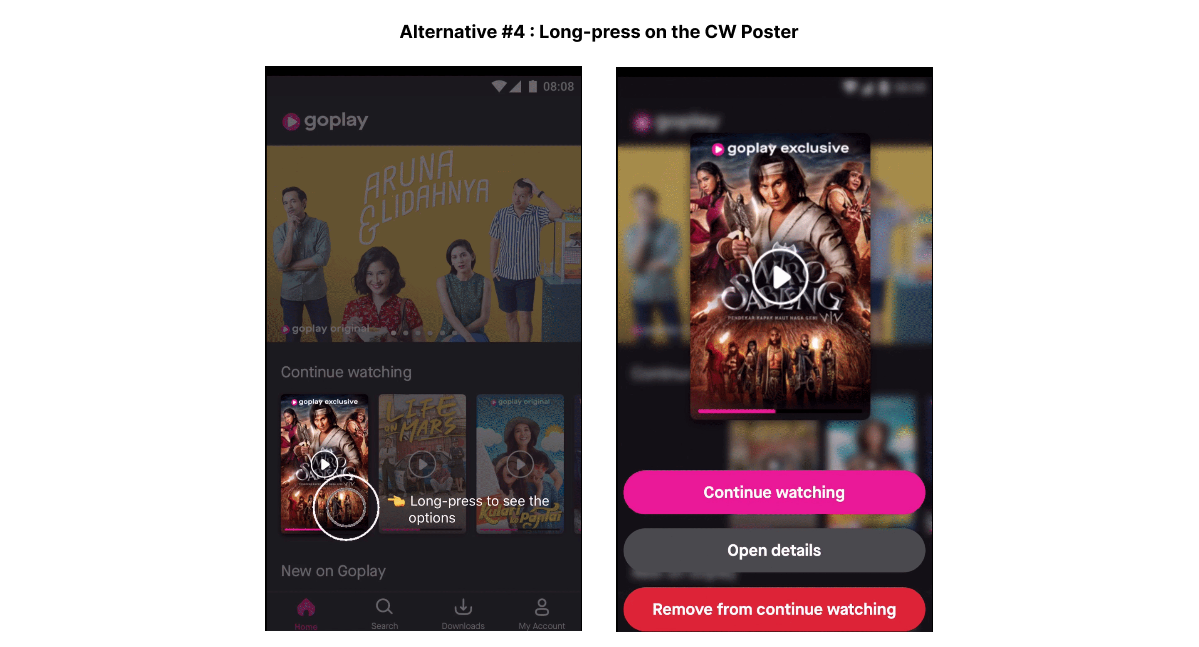
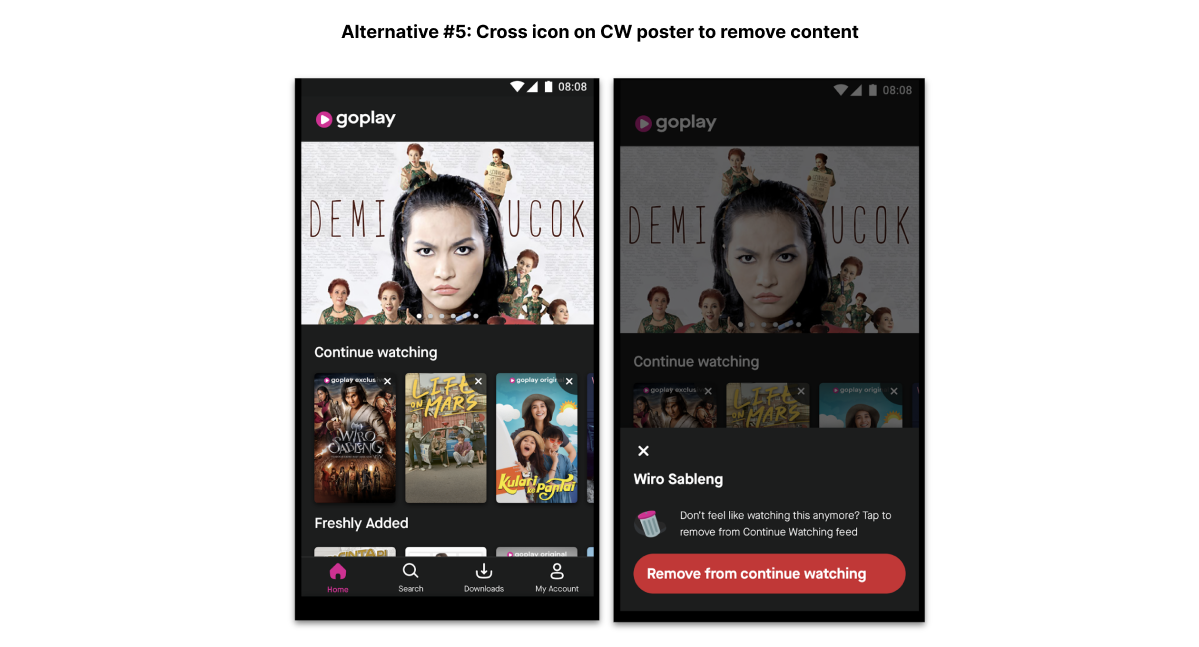
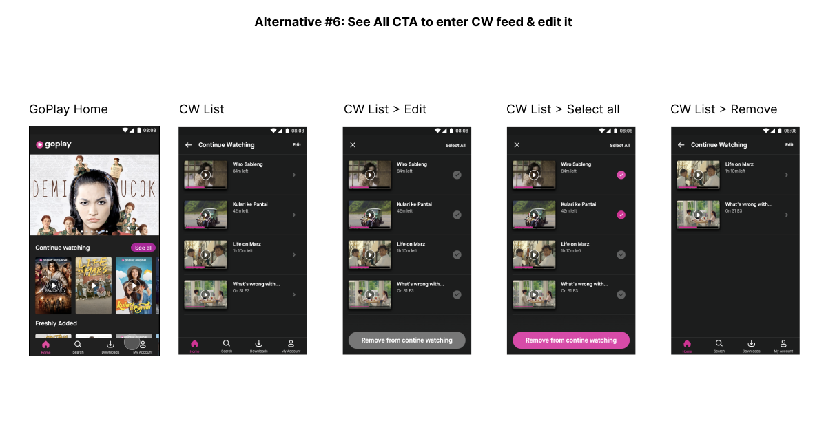
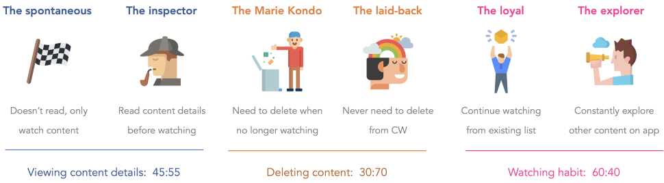
1. Usability test: Decide best behaviour for continue watching feed—
- Do users need to view content details once catalog is on CW list?
- Explore user’s habits of deleting content from CW list

We don’t know how users view the content details when they want to continue watching something, and if they want to delete the contents on continue watching section.
Most important behavioral questions
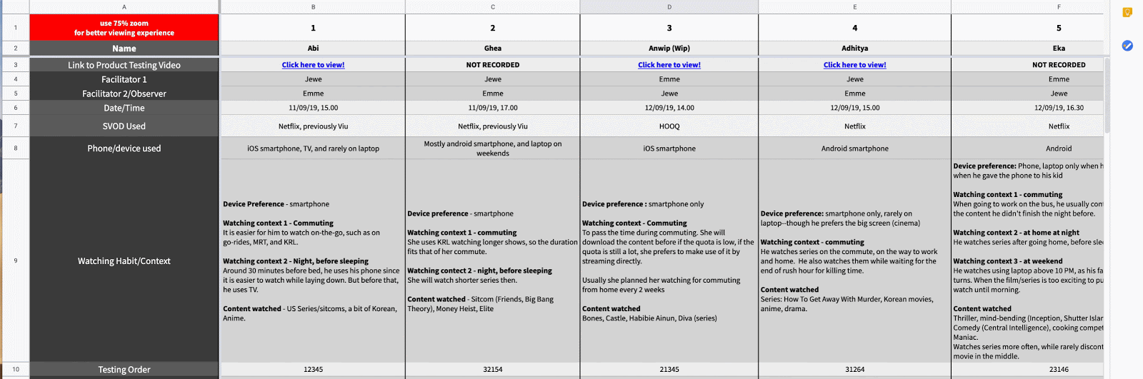
12 consumers were selected from the GoPlay MVP app. Each of the session consisted of short interview and cross-questioning and product testing lasting for 45 minutes in total. Facilitator leds the session based on the script. Observers focus on note-taking and towards the end have an opportunity to ask follow up questions.
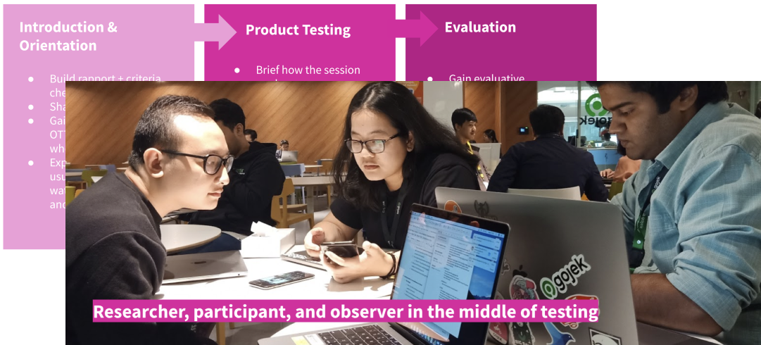
User Research session with one of Goplay's consumer
In total six alternative were send for usability testing to examin which alternatives users prefer and why? Primary goal was to understand user-behaviours and existing habits around the contining watching list.
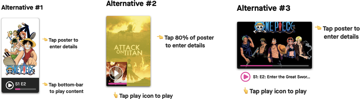
Alternative #1 and alt #6 were the most preferred
Research Findings
- We found two user types on viewing content details in context of continue watching
- We found two user types on deleting content in context of Continue Watching section
- We also found two user types on their watching habit
👑 Alternative #1—
40% more effective in task completion rate and 23% more efficient as compared to MVP
“The (play and details) button is separated, nice.”
“I’ll watch the content with the fewest minutes left first.”
👑 Alternative #6—
Task satisfaction rate increased 66% vs MVP design
“Remove automatically once I’m done watching”
“Its okay if this feature is inside coz we won’t use it that often but it’s Something nice to have”
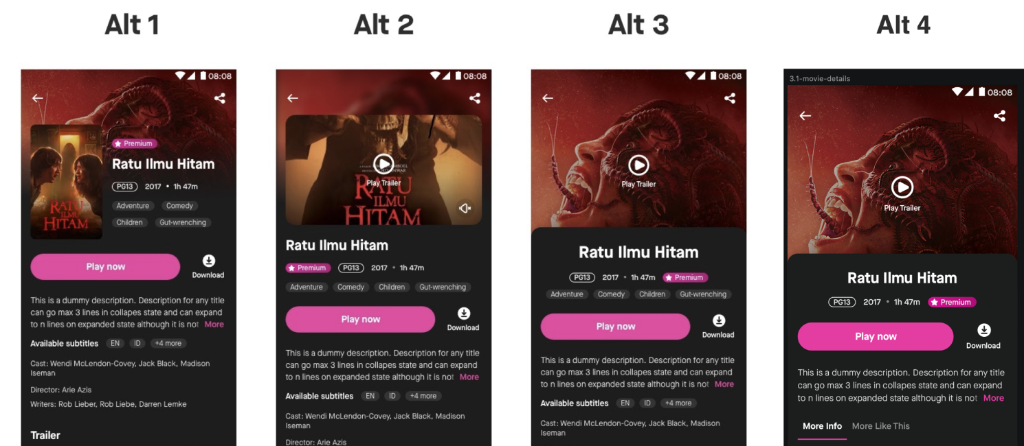
2. Cards sorting exercise: Redesign details page IA including Trailers—
- How should the information be structured in the page?
- Where should trailers be placed?

I created multiple variation of the details page & ran it through design reviews and usability test to conclude what layout suited GoPlay the best. It was alternative #4 that passed the usability test & was loved the most by co-designers during design-review. But information hierarchy was still an open question.
Now to understand what information hierarchy is best suited for the users, We sent out an online hybrid card sorting exercise to a total This being a qualitative research We requested our participants to take a minimum 10/15 minutes out of their schedules and do this exercise being 100% true. We Made sure this pool of users have watched at least one movie and one series on any streaming apps in the past 1 month.
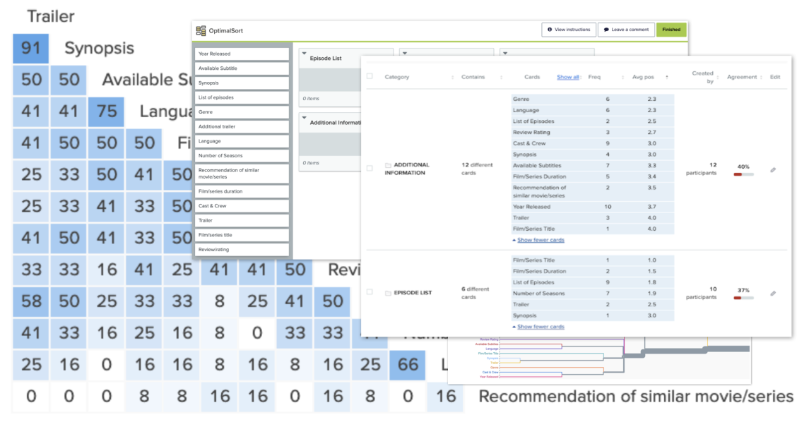
The card sorting exercise gave us most preferred category to item mapping along with their order of item priority w.r.t each users preference. We then mapped similarity matrix to understand the most suited average of cumulative preferences.
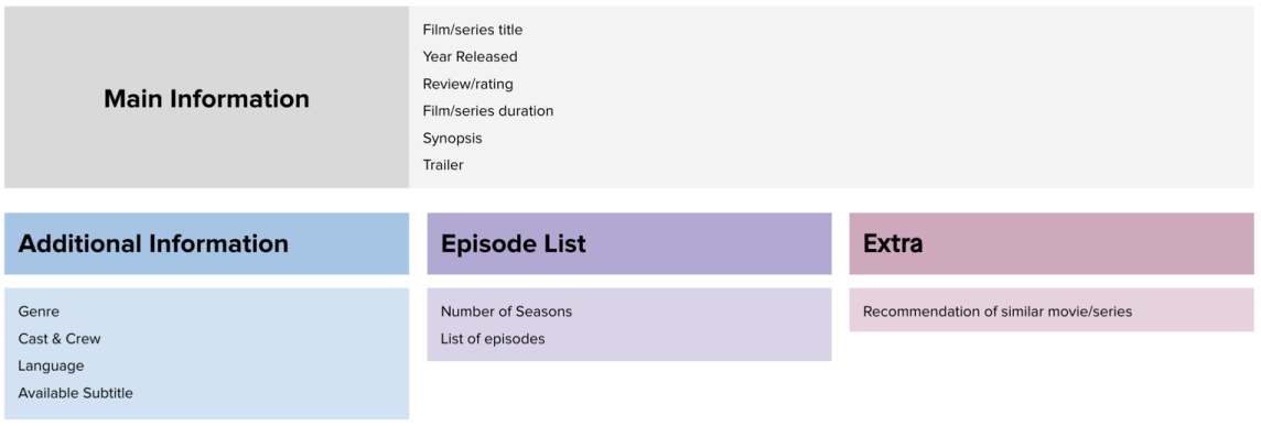
And with votes & average similarity ranks the final IA for the redesigned detail-page was decided.
3. A/B test: Personalise the content displayed on home page to retain users—
- To what extent are user satisfied by it?
- Is there any trade-offs of the solutions?

In production today different presentation layers(feed order/copy/theme-card backgrounds) are being A/B tested with various segment of users based on differences in behavior that we continue to read via analytics.
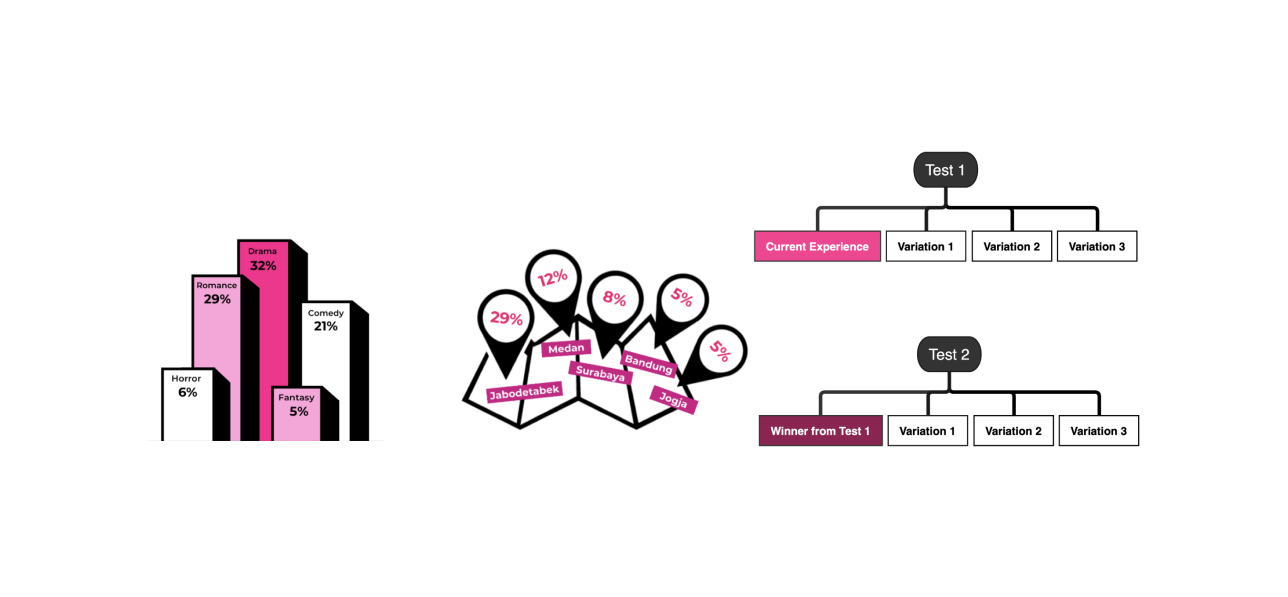
Setting context and tone is crucial in ensuring that potential viewers are able to relate to the expectation of the story. Such expectations can lead to their interests in finding out more about the series.
“Observe what people DO and not only relay on what they SAY”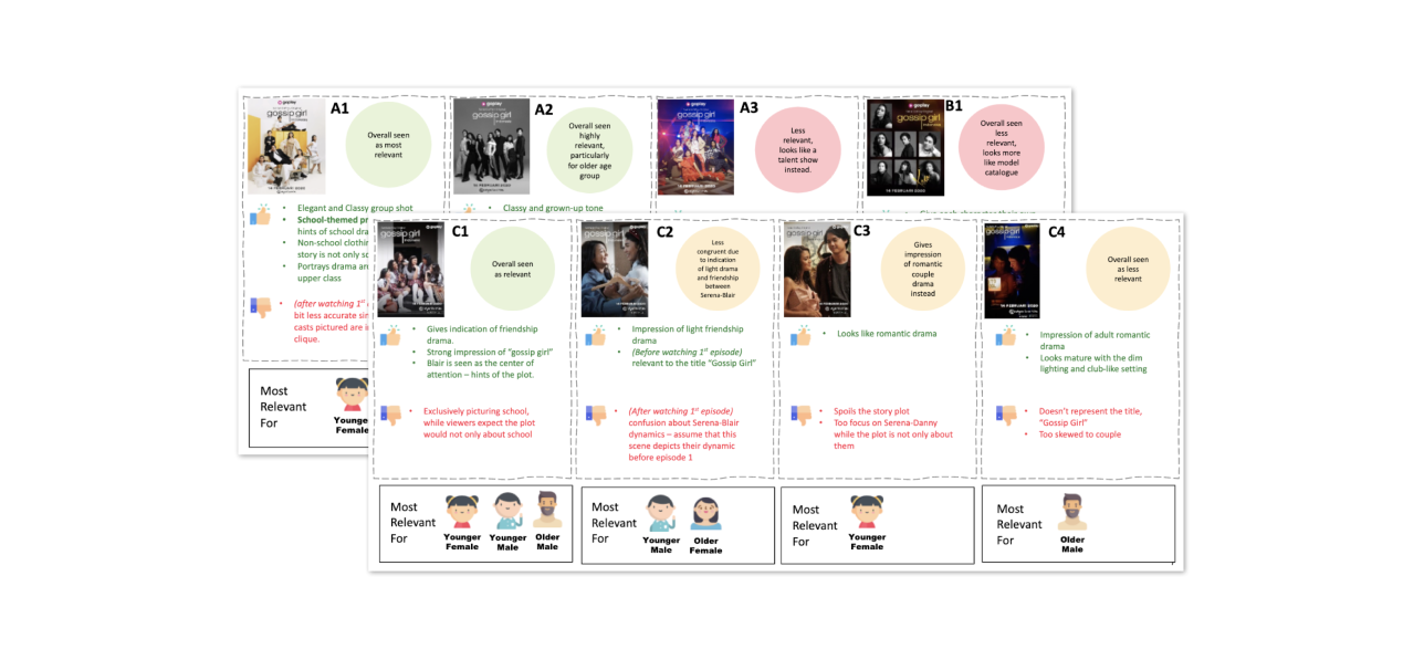
A/B testing various poster options
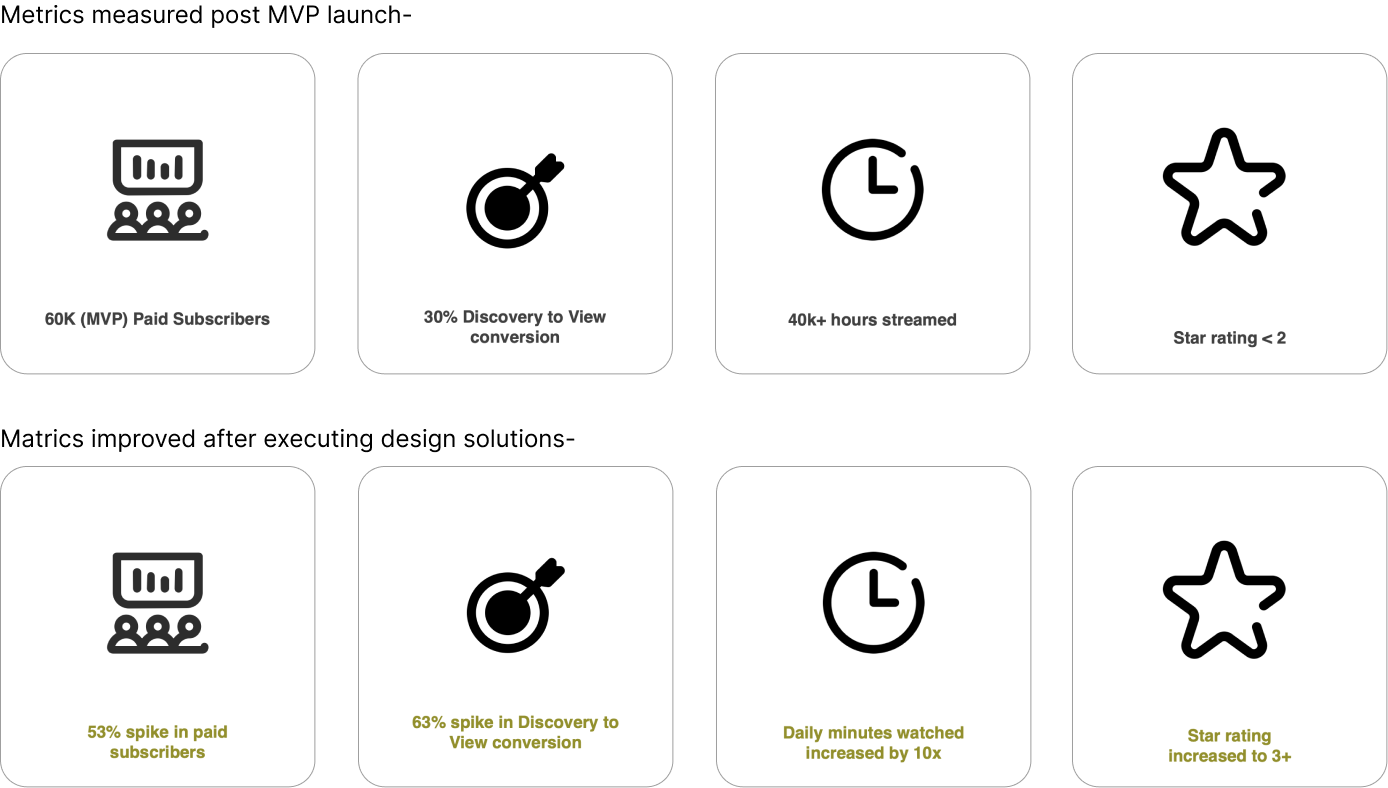
The Impact
And finally all the experiementations did pay off. In 3 quaters the result of the above experimentations looked very positive and we were ready for the next challange! But that's for next time :)
What was next?
With rapid experimentation keeping the user at center of it GoPlay continued to be eveolved. My last project was the addition of Smart TV app that we collaborated with the Wonderful Web Ixd at Gojek. Adding a few screenshots of the SamrtTV and Web Interface to close it :)
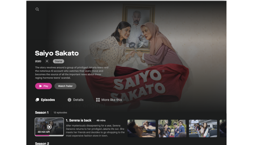
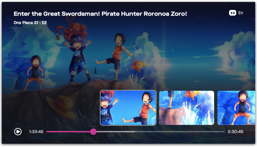
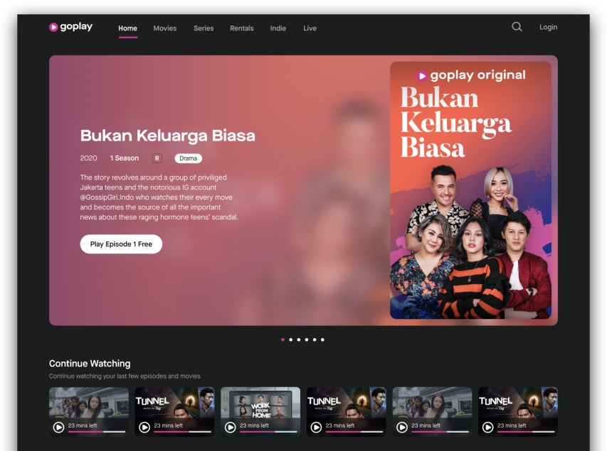
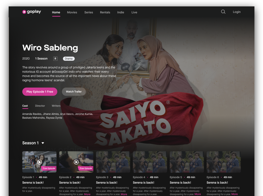
SmartTV and Web Interface