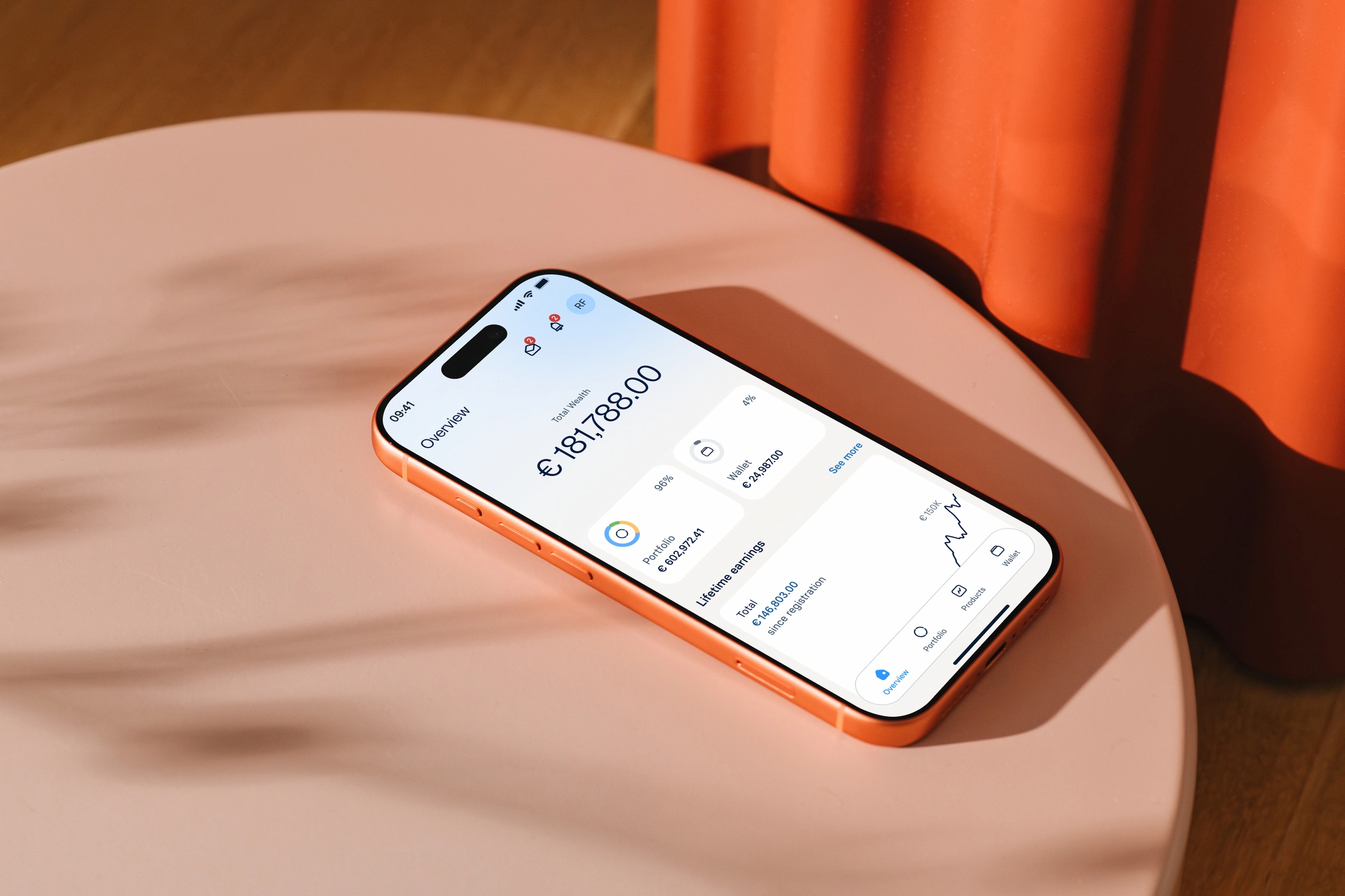
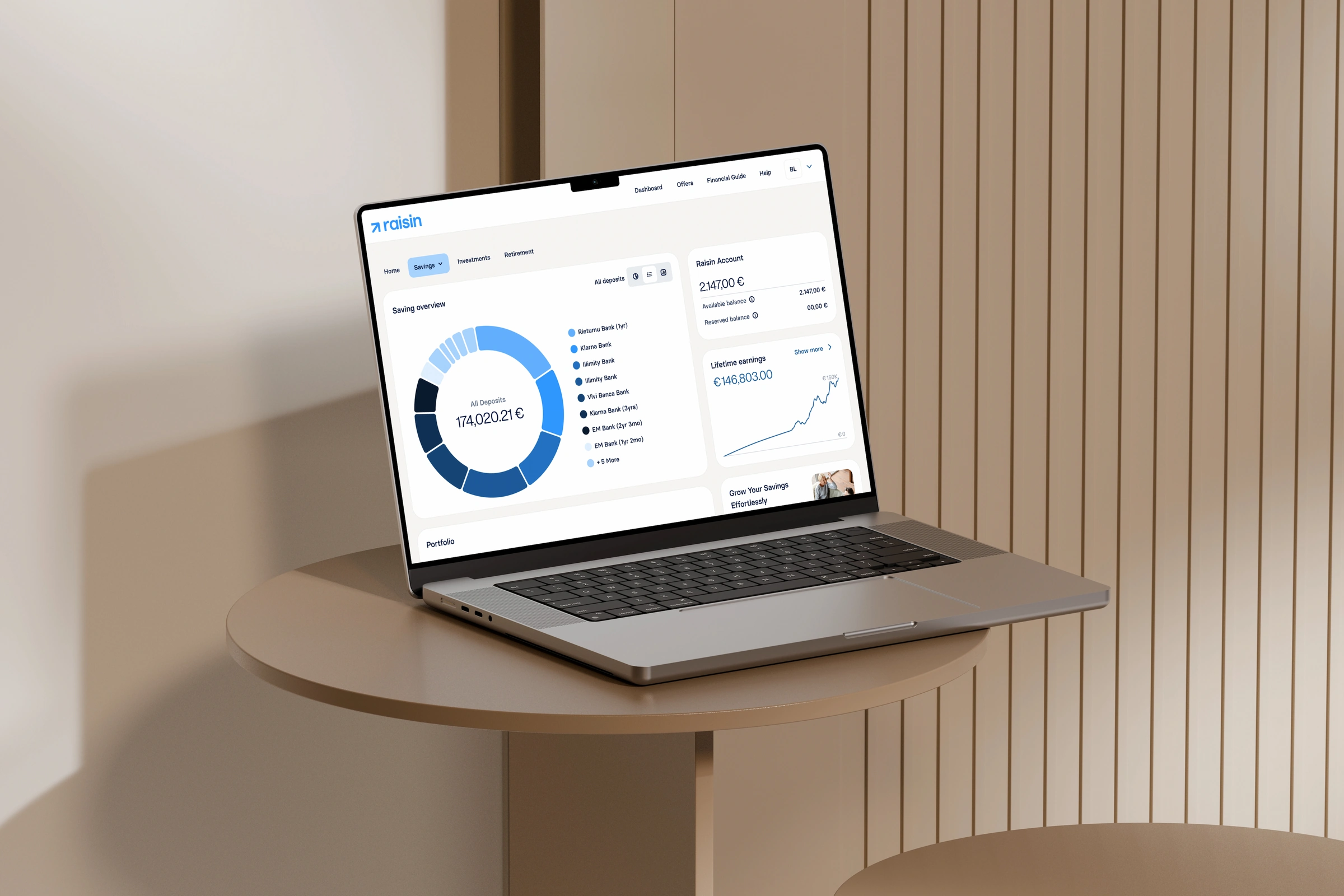
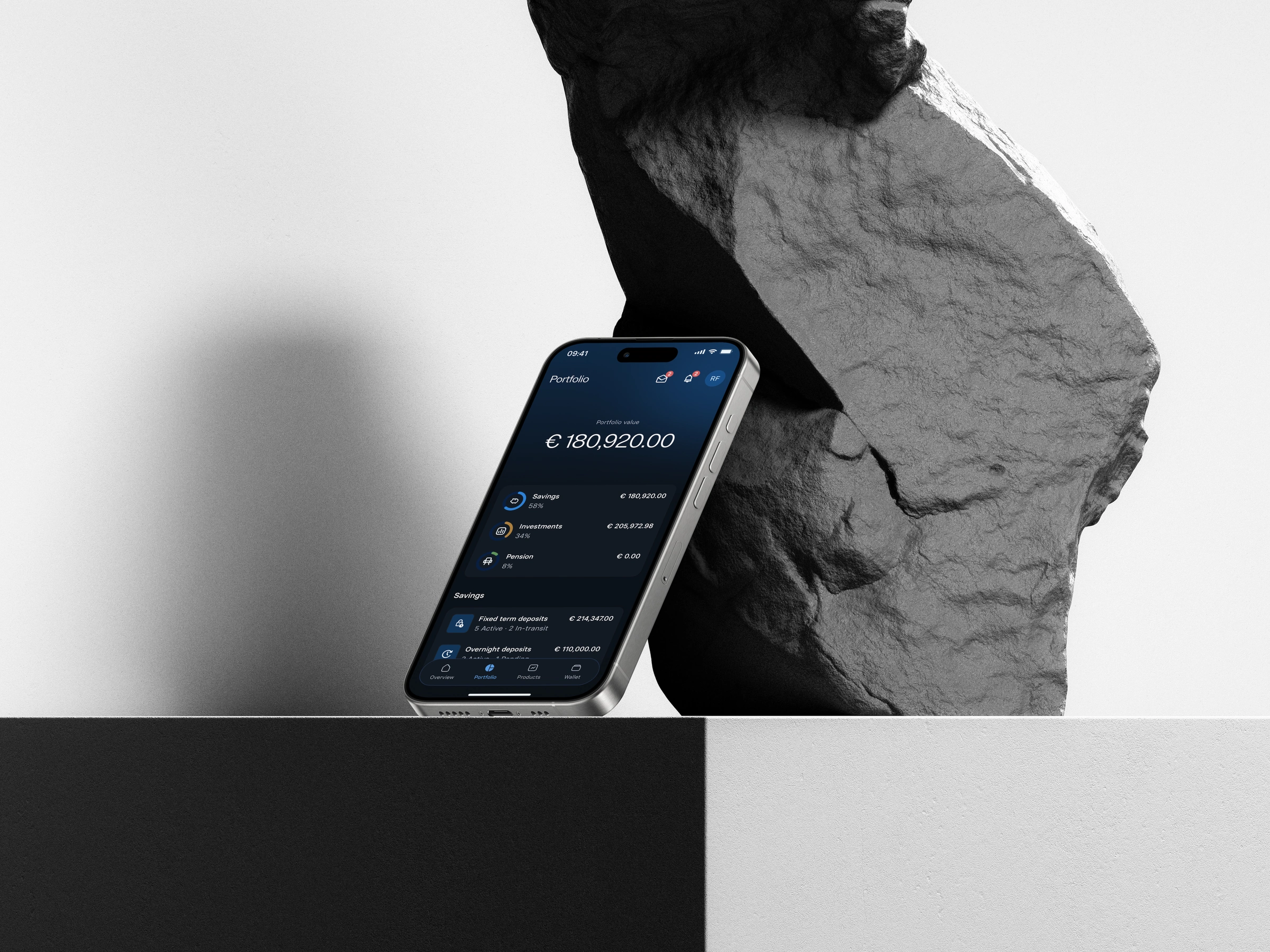
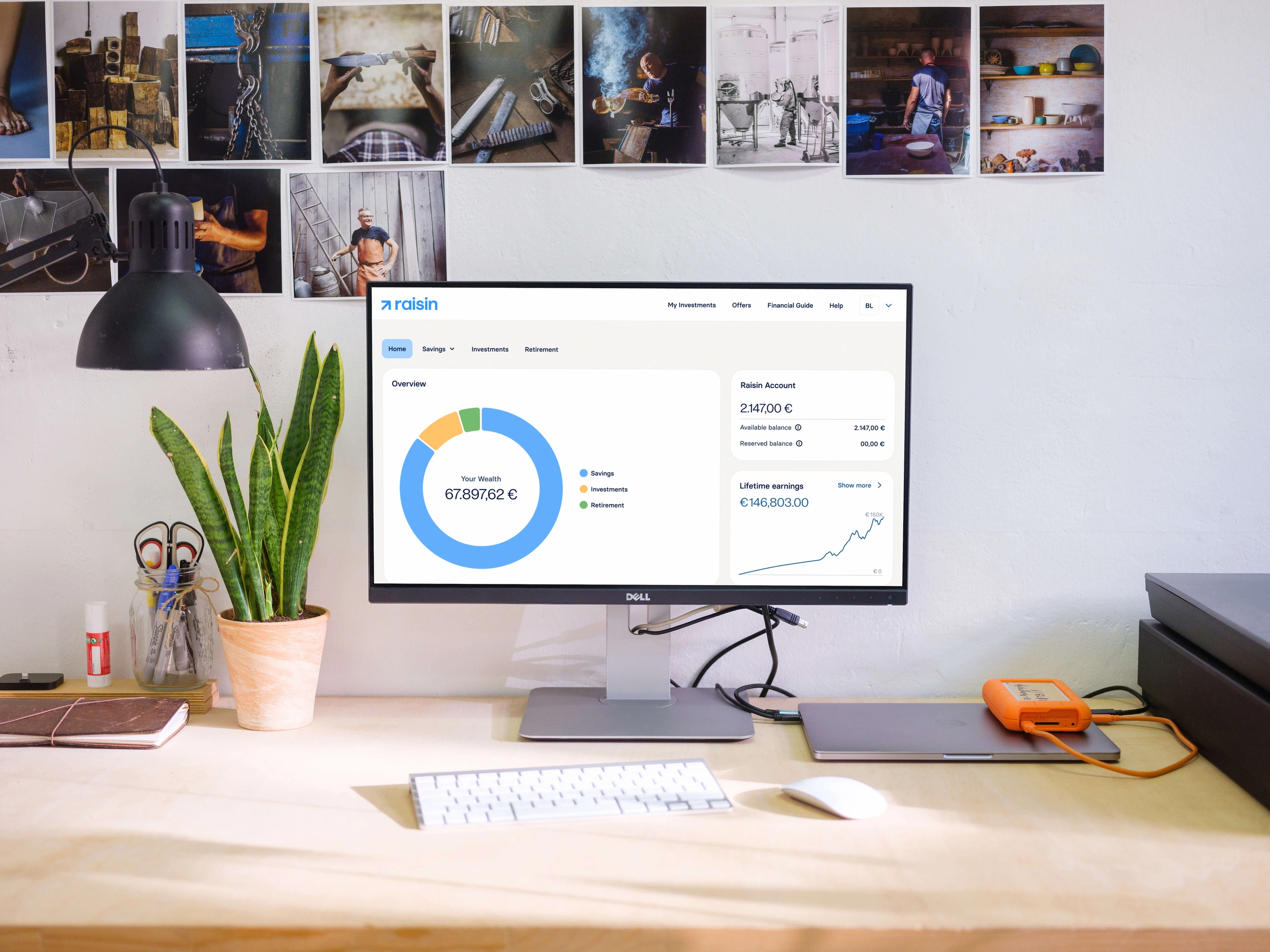
Raisin is a European savings and investment marketplace — with ~€80bn in assets under management.
Solo designer embedded in the B2C Growth and Engagement tribes — reporting to VP Design, taking project brief from Head of Product.
The starting point
Raisin was evolving its brand across product, mobile, and email — without an operating model to make that evolution stick.
Identified Gap 01
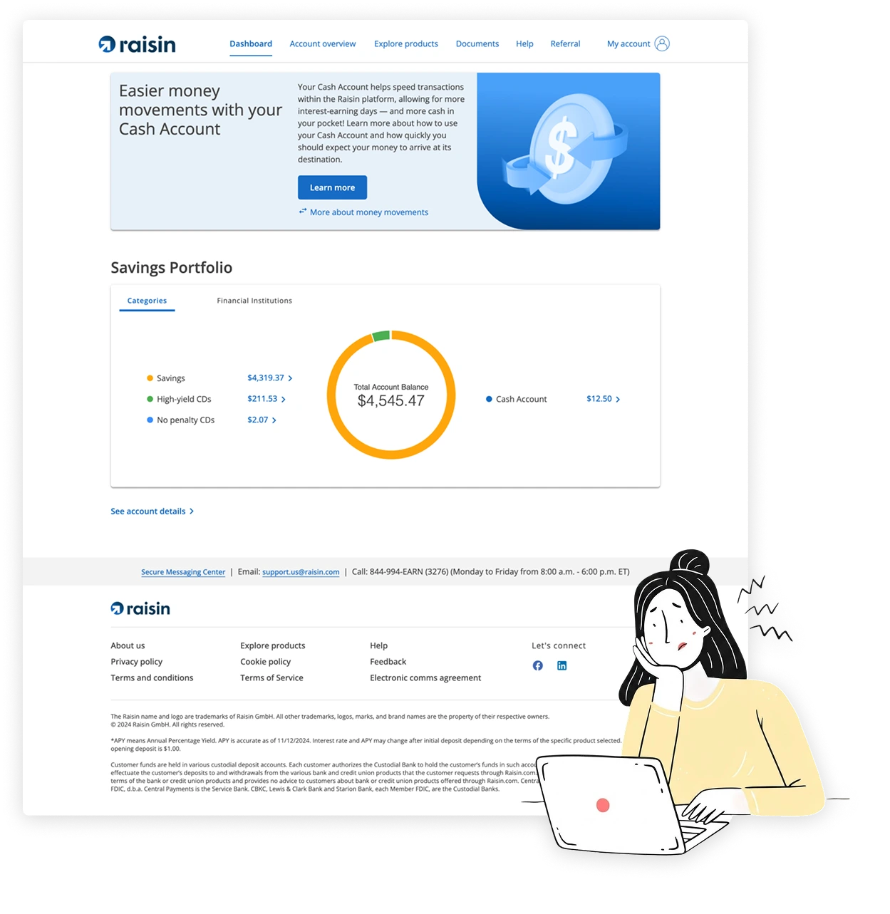
A fragmented product experience
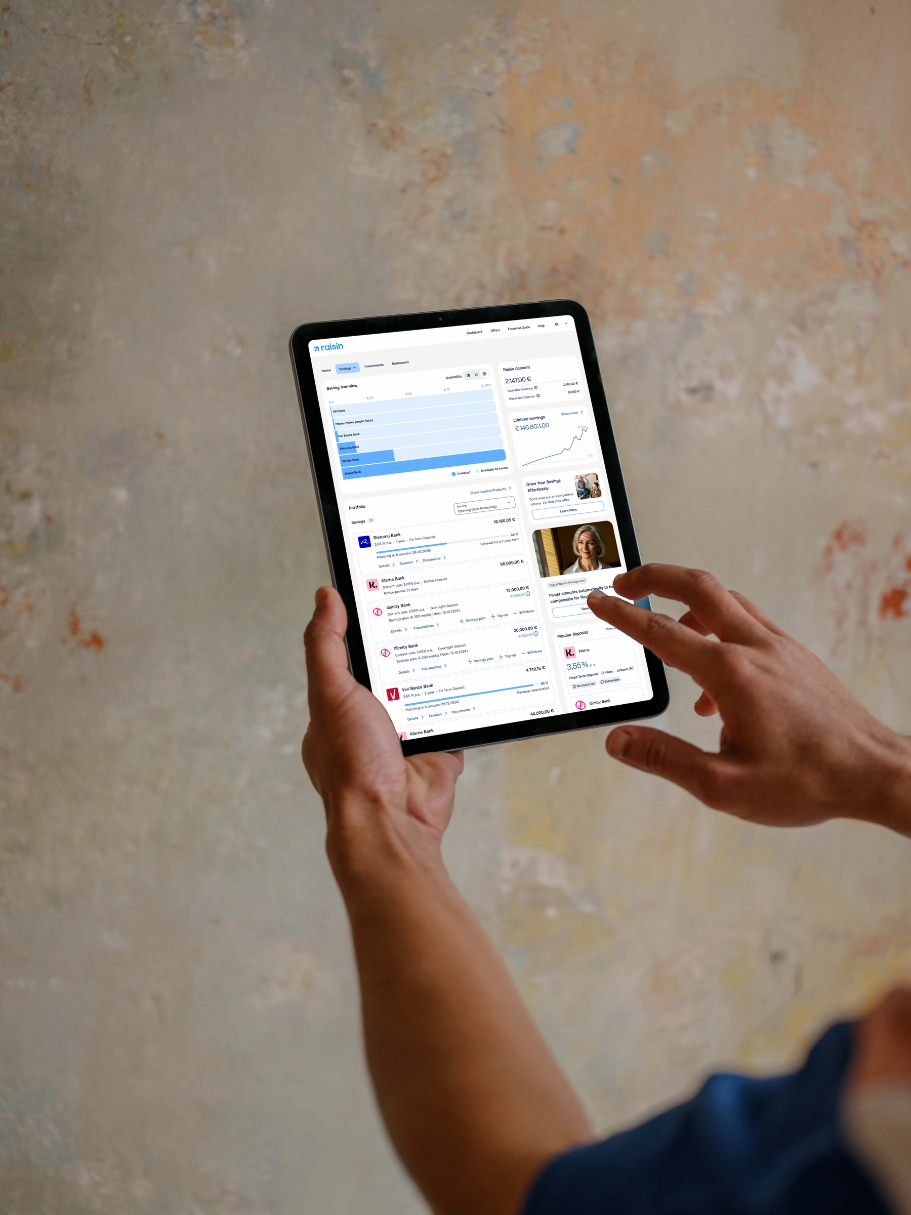
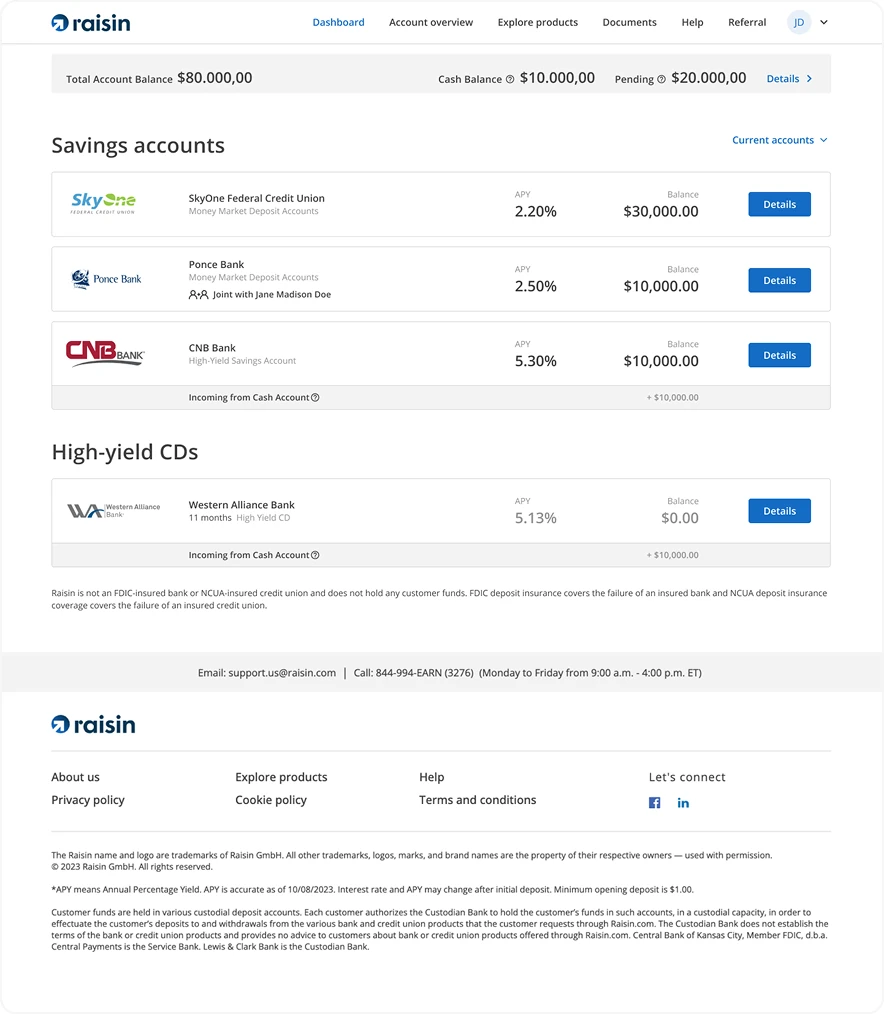
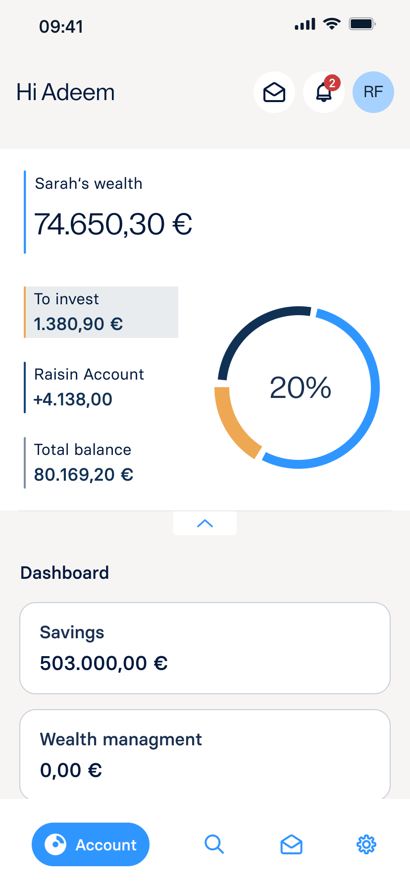
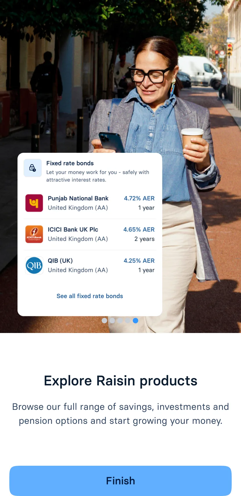
Diagnosis: Web showed a catalogue, not holdings. Mobile and email were different products — no single home for wealth.
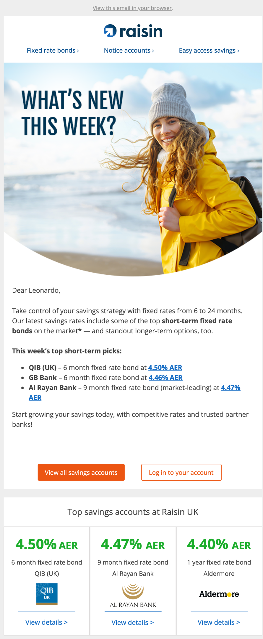
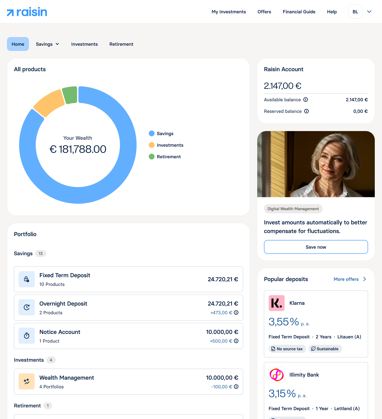
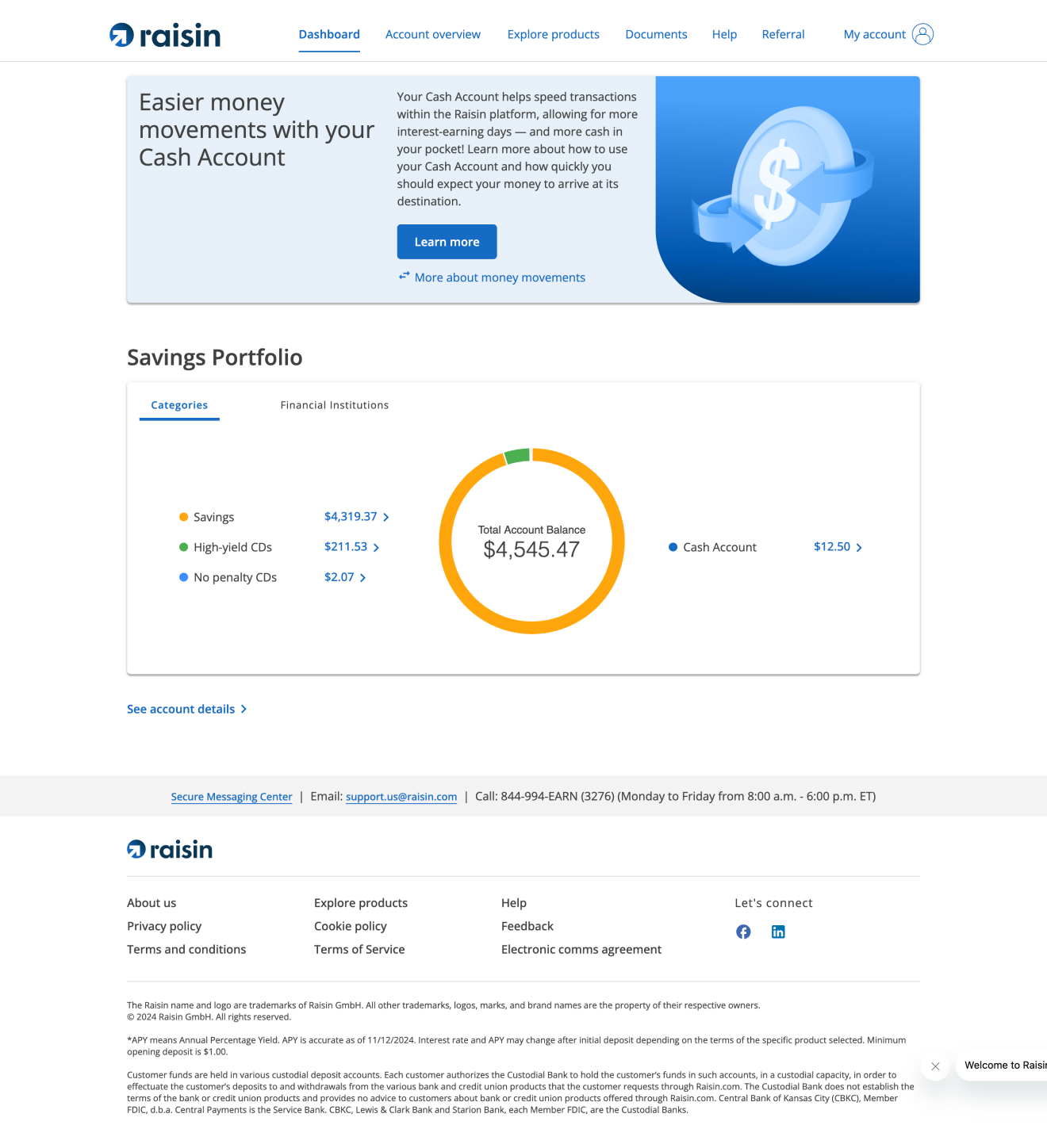
Diagnosis: On web, customers met a catalogue — not their holdings across categories. On mobile, the same job met a different product and the emails didn't match visual language. One customer, no single home for their wealth.
Identified Gap 02
A brand handed over, not built out
Diagnosis: Koto handed off a static identity — not a live, multi-market product brand.
Diagnosis: Brand agency Koto delivered a static identity. After handoff, Raisin design had to scale it across product experience — guidelines existed; a live, multi-market product brand did not.
Identified Gap 03
A design practice without shared conventions
Diagnosis: Ad hoc craft and weak research rhythm — every initiative paid a tax.
Diagnosis: The rebuild needed a team that could move as one system. What existed was ad hoc — loosely shared craft conventions, a weak research rhythm, and siloed workflows — so every initiative paid a tax, including later work on AI.
— Product brief
Journey
Two programmes, run in parallel — not one tidy sequence.
Practice = outcomes · Enablement = capability. Brand evolution and team rituals — in parallel.
My remit: close the three gaps — brand evolution into live product (absorb the agency handoff and carry it into the surfaces customers use; redesign web, mobile, and communication into one home for their wealth), and enablement in parallel (ways of working, research and critique rituals, craft standards, and the AI programme) so the team could sustain it. Practice = customer outcomes. Enablement = team capability. I where I owned it; we at tribe scale.
“Redesign the Raisin B2C Dashboard in alignment with Global Re-Branding & Domain Unification that drives customers to protect, grow, and reinvest their wealth within Raisin.”
Impact: Support Global Growth, Enhance Customer Engagement, AuM Growth & Retention, Cross-Selling & Margin Diversification
Enablement
Rituals, research OS, docs, tooling, coaching — I built; the org adopted.
Impact: Research rituals, playbooks, AI workflows, and coaching the org adopted.
01
B2CGrowth tribe7 months
A home for their wealth
Catalogue landing, not a home for wealth. Research → trade-offs → Wealth Hub MVP across 12 markets.
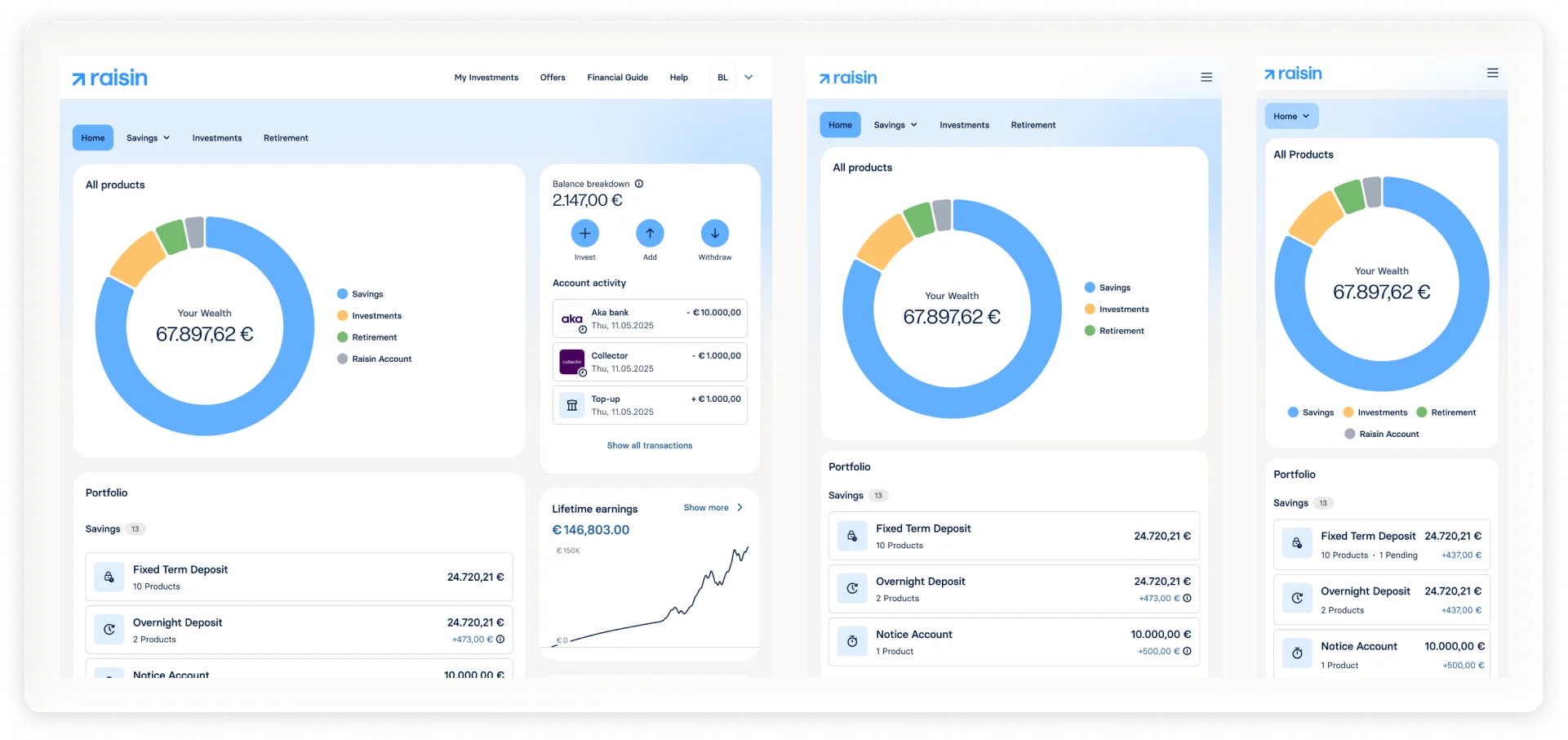
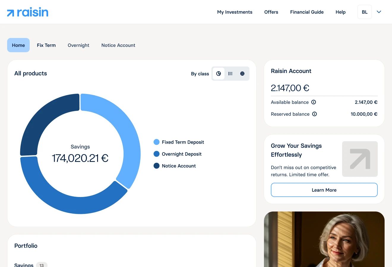
The web dashboard still behaved like a product catalogue — deposits first, not the customer’s holdings. This chapter turns that surface into a single home for wealth across savings, investments, and retirement, and carries the new brand into a live, multi-market product.
I led Wealth Hub research, IA, and the design bets. We shipped MVP across 12 markets.
Baseline research · 🇩🇪 · One week · 4× designers
Qualitative baseline: Weltsparen through customers’ eyes.
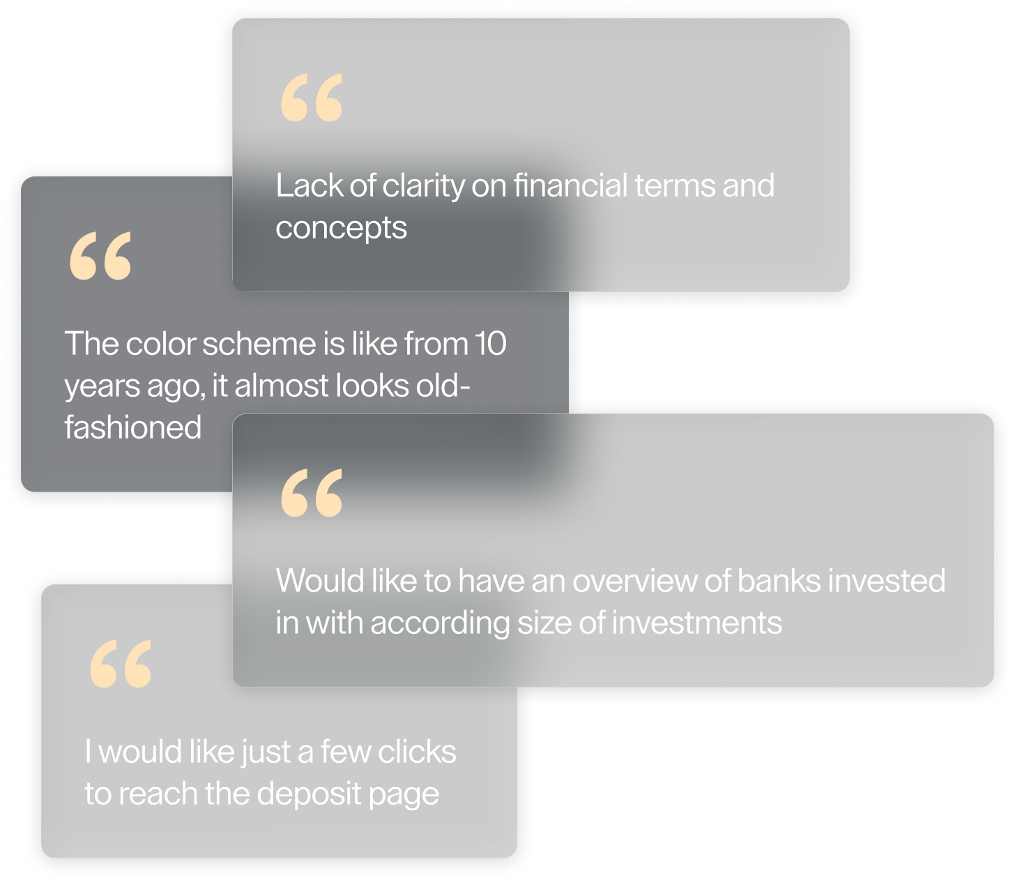
We sat with B2C customers and asked what Weltsparen actually felt like after login — what they needed, what was missing. Not a polish brief; a test of whether a redesign was justified.
Affluent Core
Affluent CoreMaintains wealth simply — retirement comfort, travel, supporting family.60% of sample · new and long-tenure mix
High Net Worth Core
High Net Worth CoreWants evidence Raisin can optimize liquidity without manual effort.30% of sample · new and long-tenure mix
Affluent Young
Affluent YoungBuilds financial peace of mind toward early retirement without cutting living standards.10% of sample · new and long-tenure mix
Customer problem
A catalogue landing, not a home for their money. Savers couldn’t orient to what they held across savings, investments, and retirement.
Orient — consolidated view across asset classes · Monitor — total wealth at a glance · Act — maturities and pending tasks surfaced
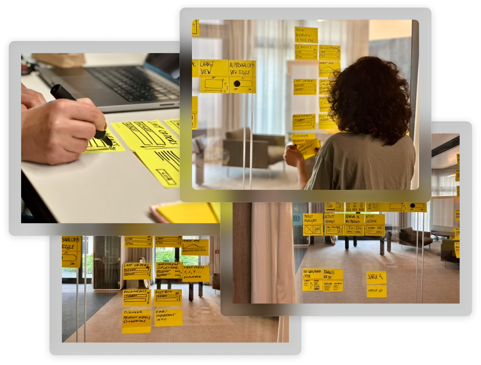
Synthesis wall — research themes clustered into How-Might-We statements
Co-creation · synthesis · two-week sprint
Synthesising research into How-Might-We statements.
3× designers collaboration · 1 week
We spent one week clustering baseline findings into themes — then translating each theme into How-Might-We statements the whole tribe could ideate against.
Most desirable · Most feasible
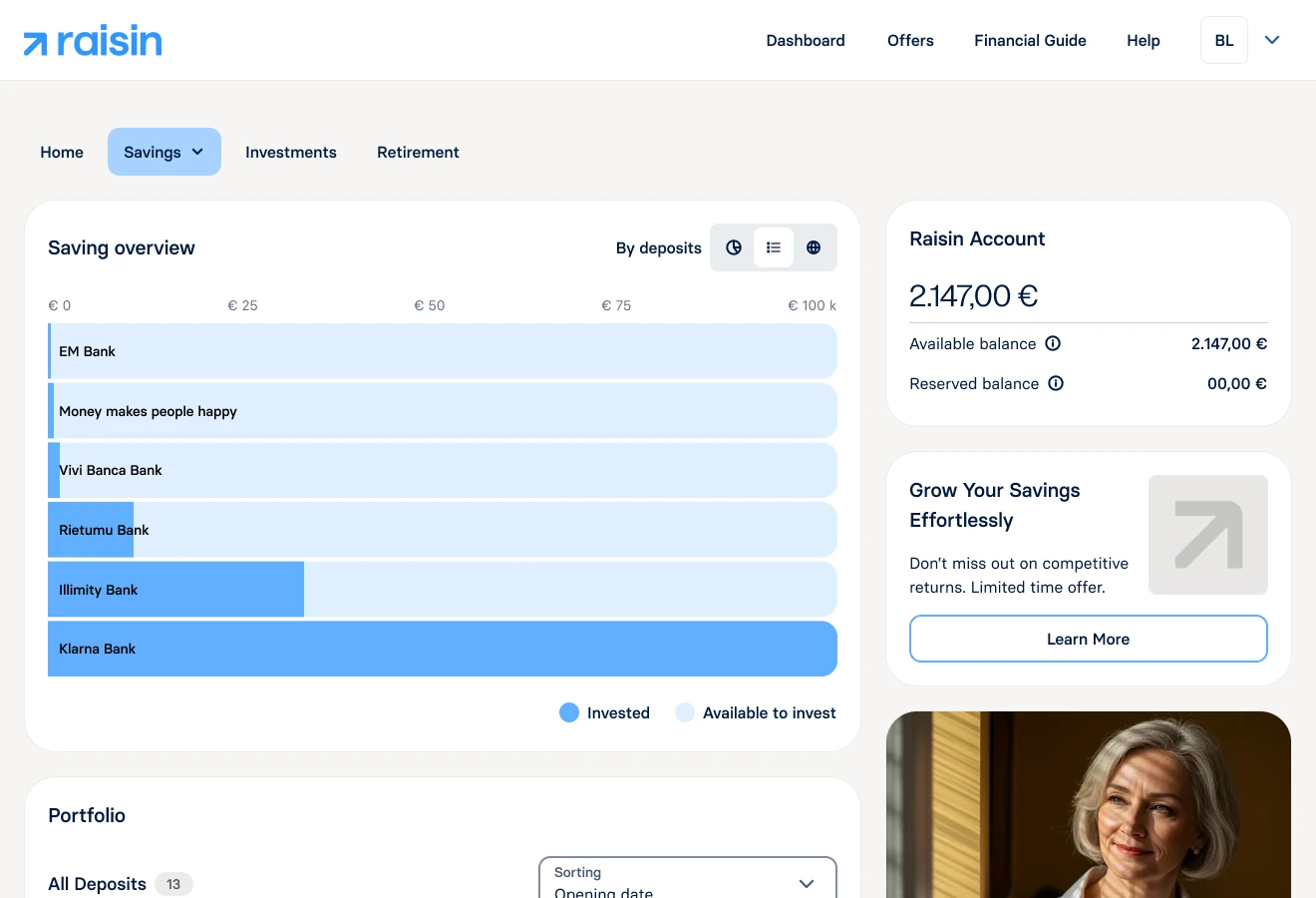
How might we make what’s held at each bank — and how much — visible at a glance?
How might we bring ease in navigating across active and available products?
How might we balance clarity in one view for what’s invested vs transactional?
→→→
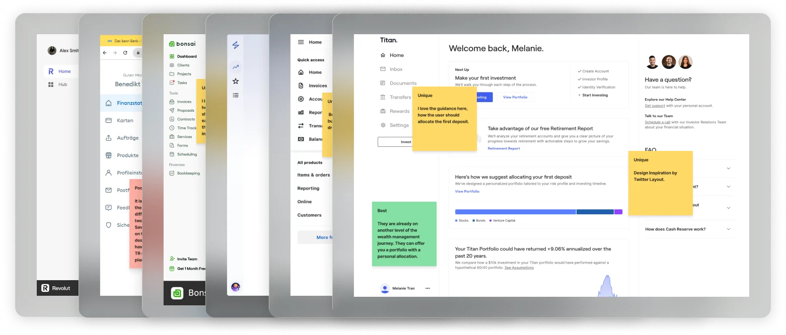
Competitive patterns — what peers showed on landing vs drill-down.
Critique with PM, HoD, and engineering — one hierarchy taken to research.
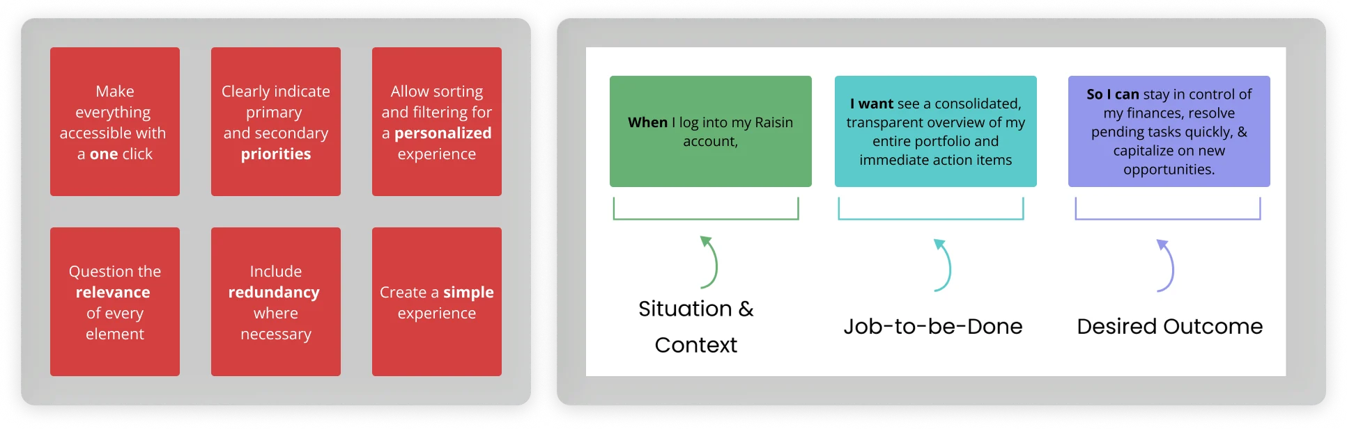
Jobs to be done and design principles from the brief.
Variation A explored in critique · B shipped — overview → asset class → bank
Wealth Hub · ideate
From brief to one testable direction.
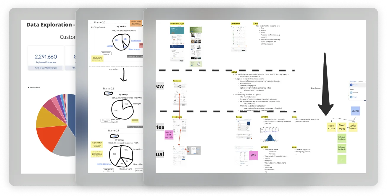
I facilitated ideation from competitive reads through wireframe critique — aligning the tribe on one holdings-first hierarchy before concept validation.
Design conflict · Product vs Design
A · Flat list
Faster to ship · reads as a product catalogue
B · Structured hierarchy
Savings · investments · retirement — by what customers hold
Position: A flat list reads as a catalogue — the problem customers named. Hierarchy orients by what they hold.
Settled: Design critique — hierarchy won over flat catalogue list.
Product design strategy · trade-off 01 · validated with customers
User research · treemap vs donut — how much detail on landing?
Several landing decisions still needed customer evidence — not critique. I led Raisin’s first international study on allocation visualization: treemap vs donut.
Sample set · 12 participants · 2 prototypes · PRE + POST-KYC · 🇩🇪 🇳🇱 🇪🇸 🇬🇧 🇫🇷
Affluent Core
Affluent CoreMaintains wealth simply — retirement comfort, travel, supporting family.Included in international study sample
High Net Worth Core
High Net Worth CoreWants evidence Raisin can optimize liquidity without manual effort.Included in international study sample
Affluent Young
Affluent YoungBuilds financial peace of mind toward early retirement without cutting living standards.Included in international study sample
Key trade-off
A · Treemap
All holdings on landing · performance per product · Raisin account as separate module
B · Donut Chosen
Allocation at a glance · account reached through the chart
Position: Overview-first landing — detail on drill-down.
Research conclusion: Donut beat treemap — allocation legible at a glance, route into account actions.
Outcome: Donut + level in/out shipped in MVP
Variation A explored in study · B shipped
Also in the study
PRE-KYC zero state
PRE-KYC zero stateEmpty-state carousel to motivate first deposit vs withholding allocation until after KYC.
Account actions
Account actionsAll account todos surfaced upfront vs one action at a time, lower on the page.
Portfolio depth
Portfolio depthPending orders plus up to three products per segment vs overview-only accordion.
Recommendations
RecommendationsPopular products in a standalone module vs categorized within portfolio segments.
→→→
Visual exploration and critique — type, layout, and hierarchy before system lock-in.
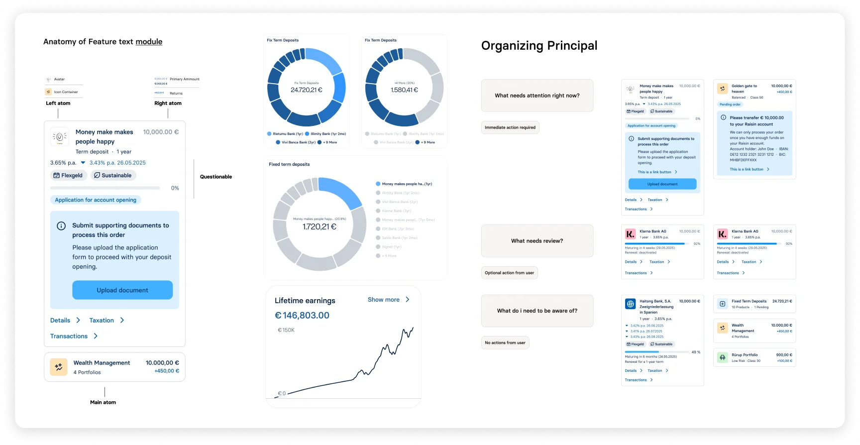
Listing row anatomy — hierarchy, metadata, and actions aligned to the component library.
Final interface — click to enlarge into scrollable view
Wealth Hub · systems
The system behind the surface.
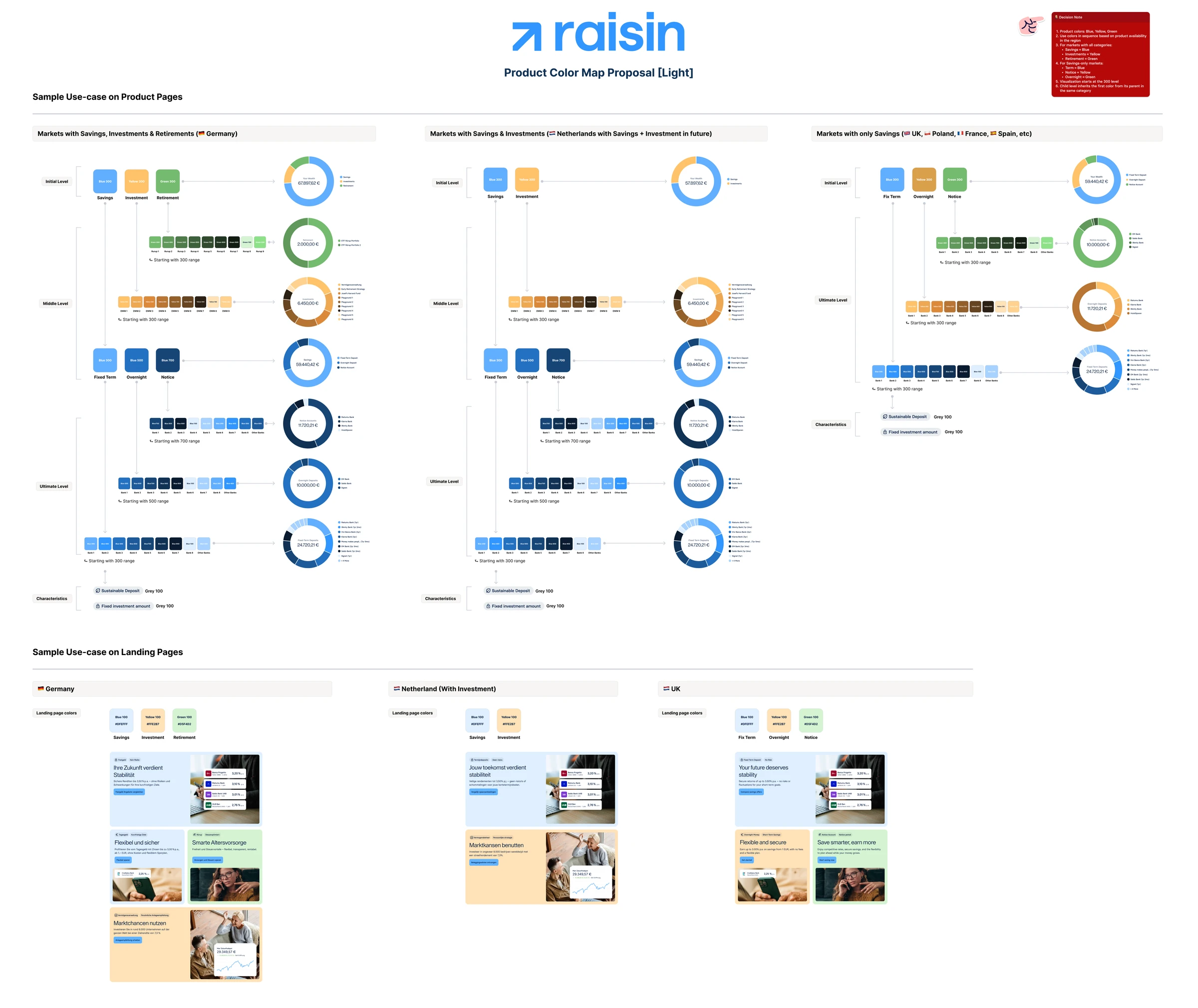
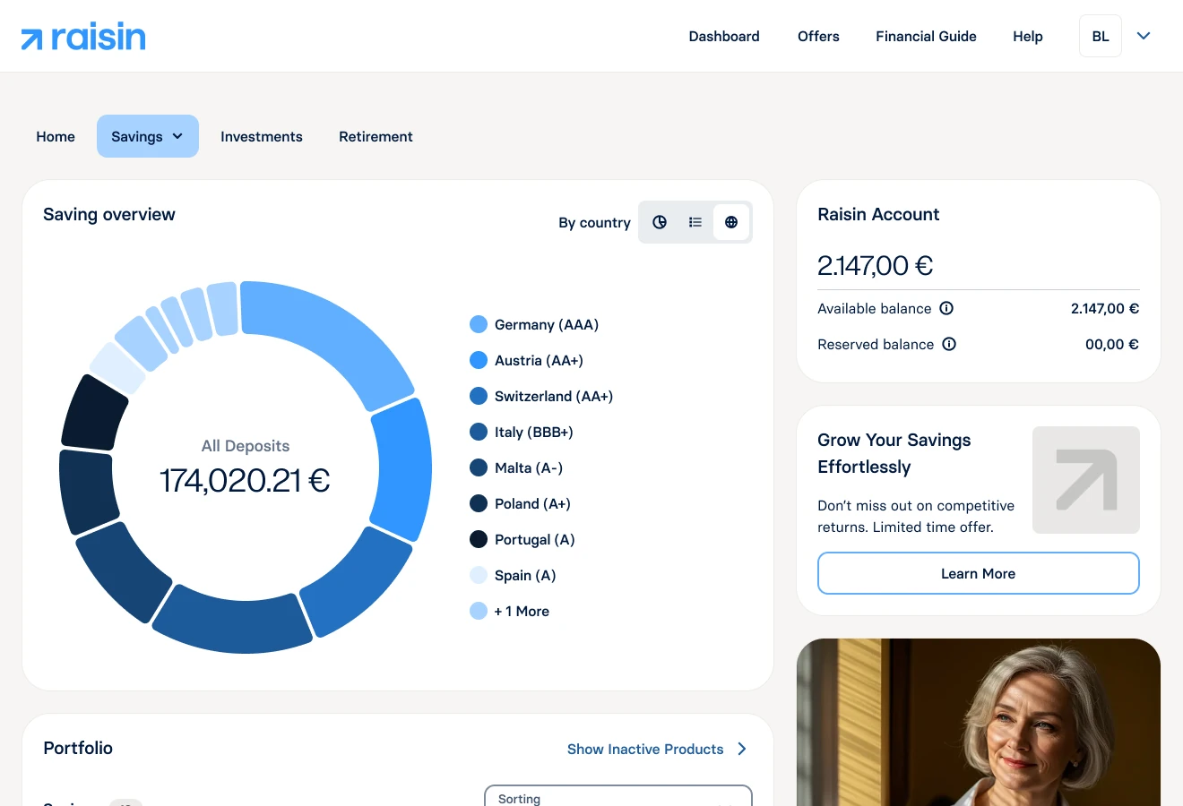
The hierarchy needed a colour system, not just a layout. I gave each asset class a distinct, accessible identity across 12 markets and both themes — savings blue, investments amber, retirement green — with rules for savings-only markets, documented so design, engineering, and markets shipped from one source.
Type, colour, layout, and components — one system for twelve markets. The colour map settled brand debate; typography, spacing, and components shipped in parallel with Foundation-fix.
After MVP launch · against targets declared before design
Launch proof: adoption held, customers felt the structure.
Customers used Wealth Hub as a home for their wealth, not a product catalogue.
Fixed API surface — design within existing endpoints, not a new data model
“Everything works great. I especially like the drill-down graphics — Overview → Fixed deposit → individual bank. That’s how every website should work.”
“Finally a dashboard that shows my full portfolio in one place — much clearer than before.”
Business context: AuM reached ~€77bn by end 2024; the dashboard migration protected NPS and HNW loyalty through the rebrand.
What customers praised wasn’t polish — it was the structure:
BeforeAfter
02
B2CGrowth tribe
Better product, Better process
MVP live — measure every release. In parallel: Ways of Working, prototyping standards, and a listening loop.
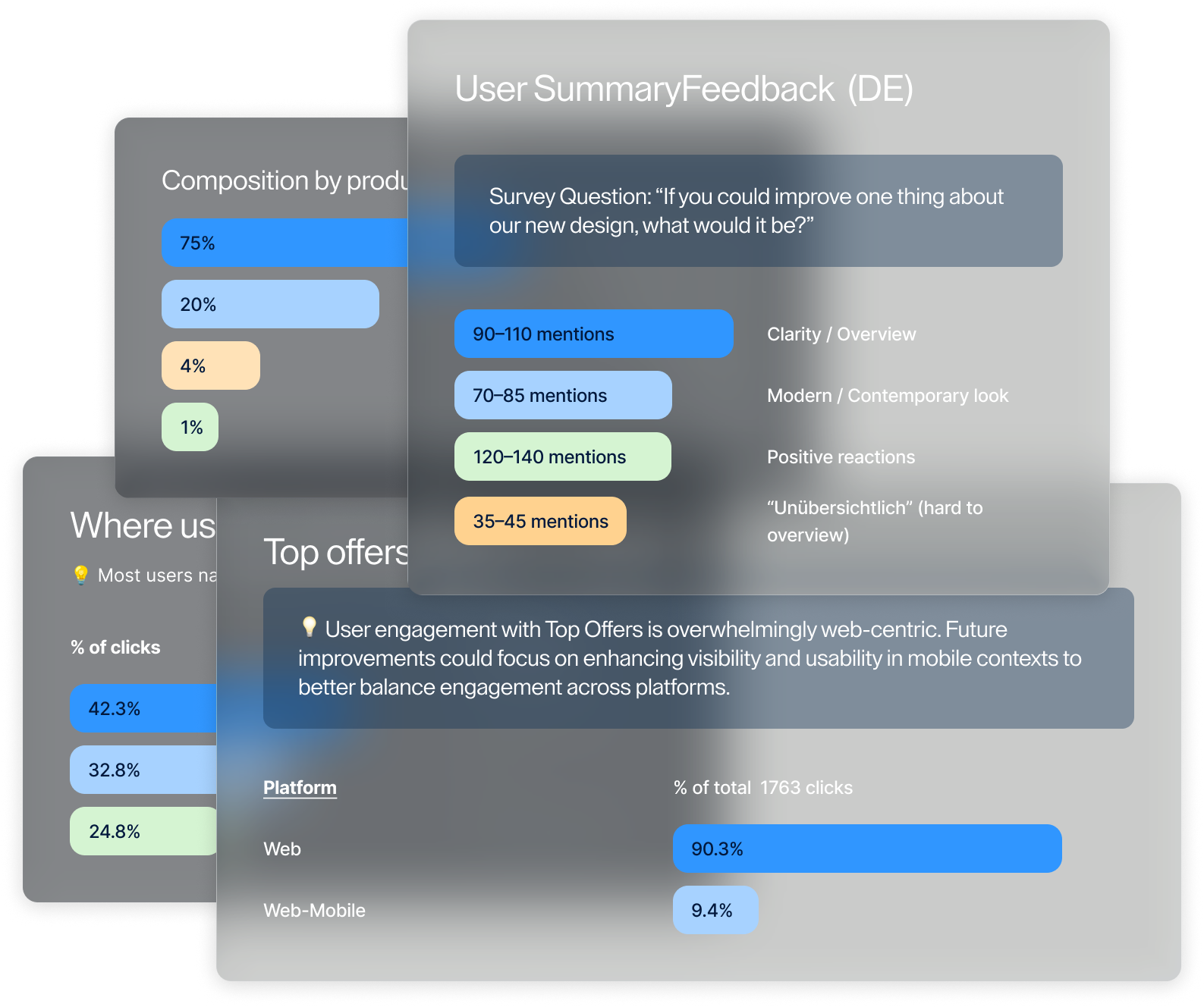
With the MVP dashboard live, we entered monitoring mode — launch surveys, direct customer feedback, and a clearer read on what each release moved. In parallel, I enabled the design team: Ways of Working, Principles of Prototyping, and a shared measurement frame so product learning and craft could compound together.
I owned post-MVP discovery and feedback-led prioritisation. I led design enablement and measurement. We shipped with engineering.
Post-MVP · listen & ship
From launch signals to incremental releases.
The MVP created a listening loop — not a second redesign brief. I turned launch signals into a prioritised release queue and measured each shipment on its own terms.
Shipped in sequence:
Release 01 Filtering
Category, deposit, and country lenses with availability.
Impact: All-deposits view led adoption.
Release 02 Zero-state
Zero-state A/B — donut carousel vs empty, two markets.
Impact: No conversion lift — visual hypothesis without enough upstream qual. Tightened how we form conversion A/Bs after. Shipped for clearer empty-state UX.
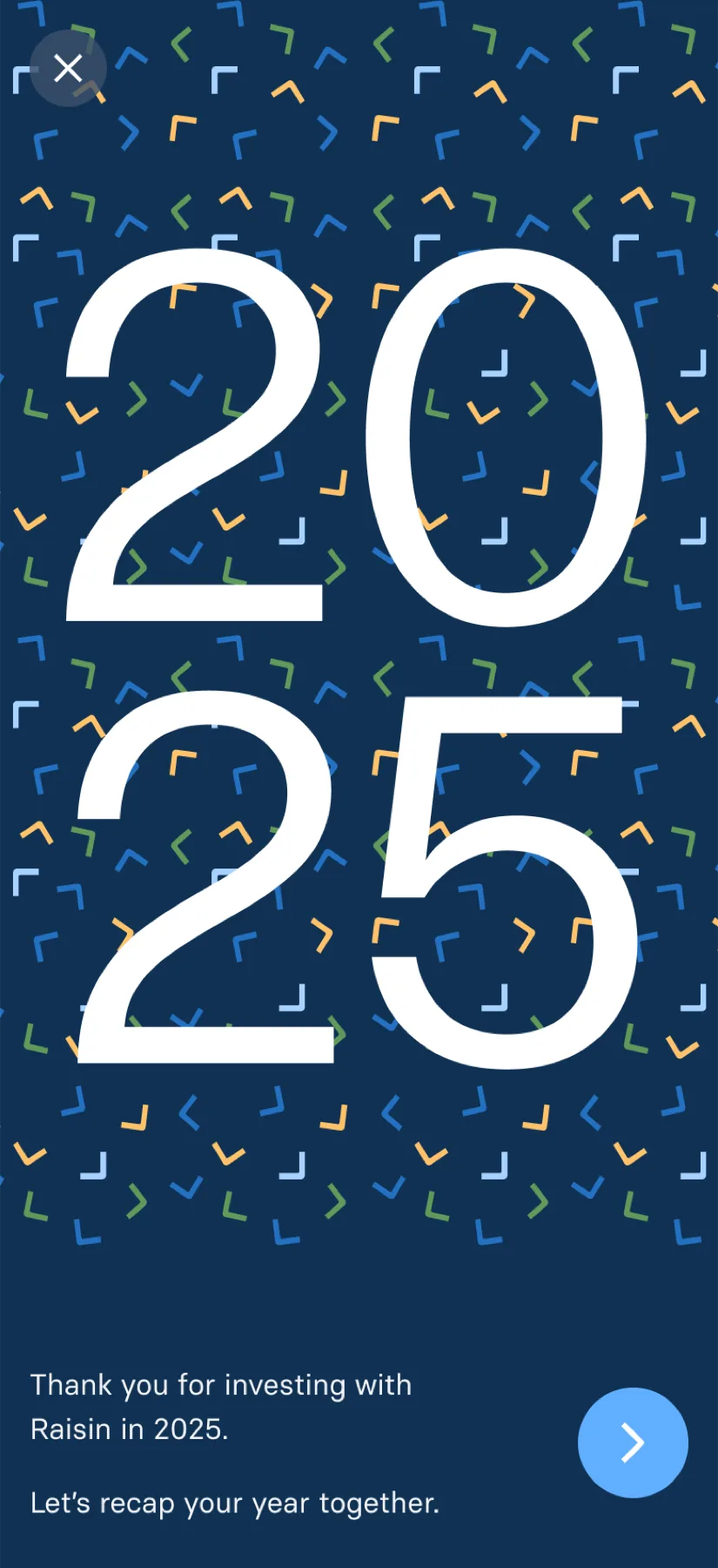
Release 03 Raisin Wrapped
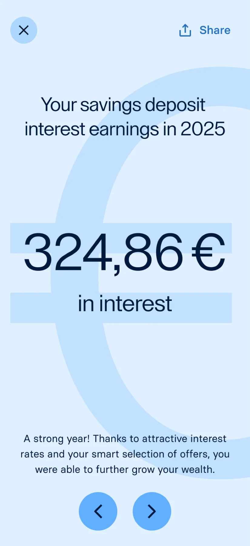
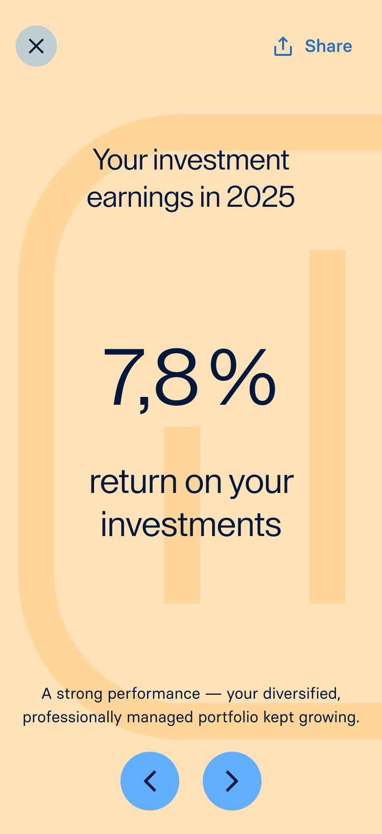
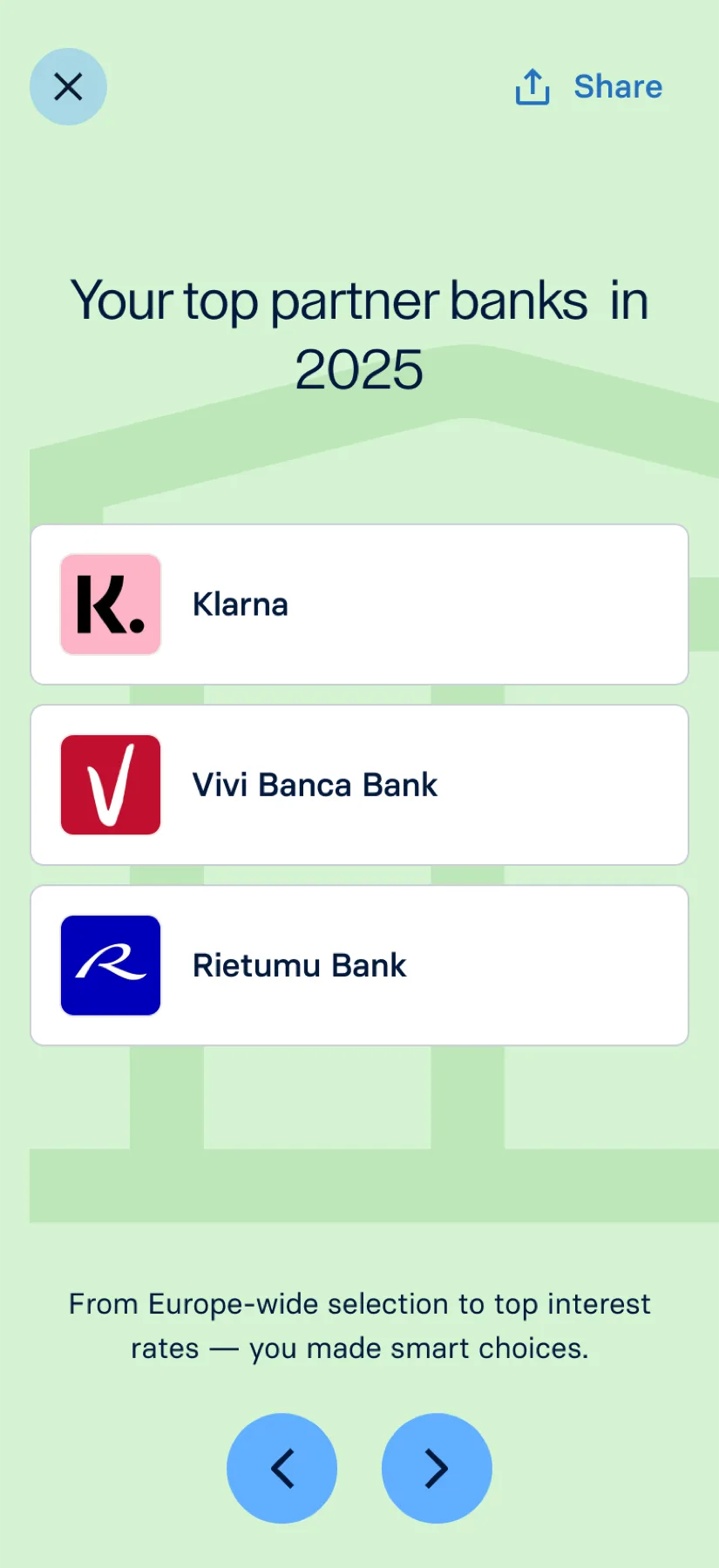
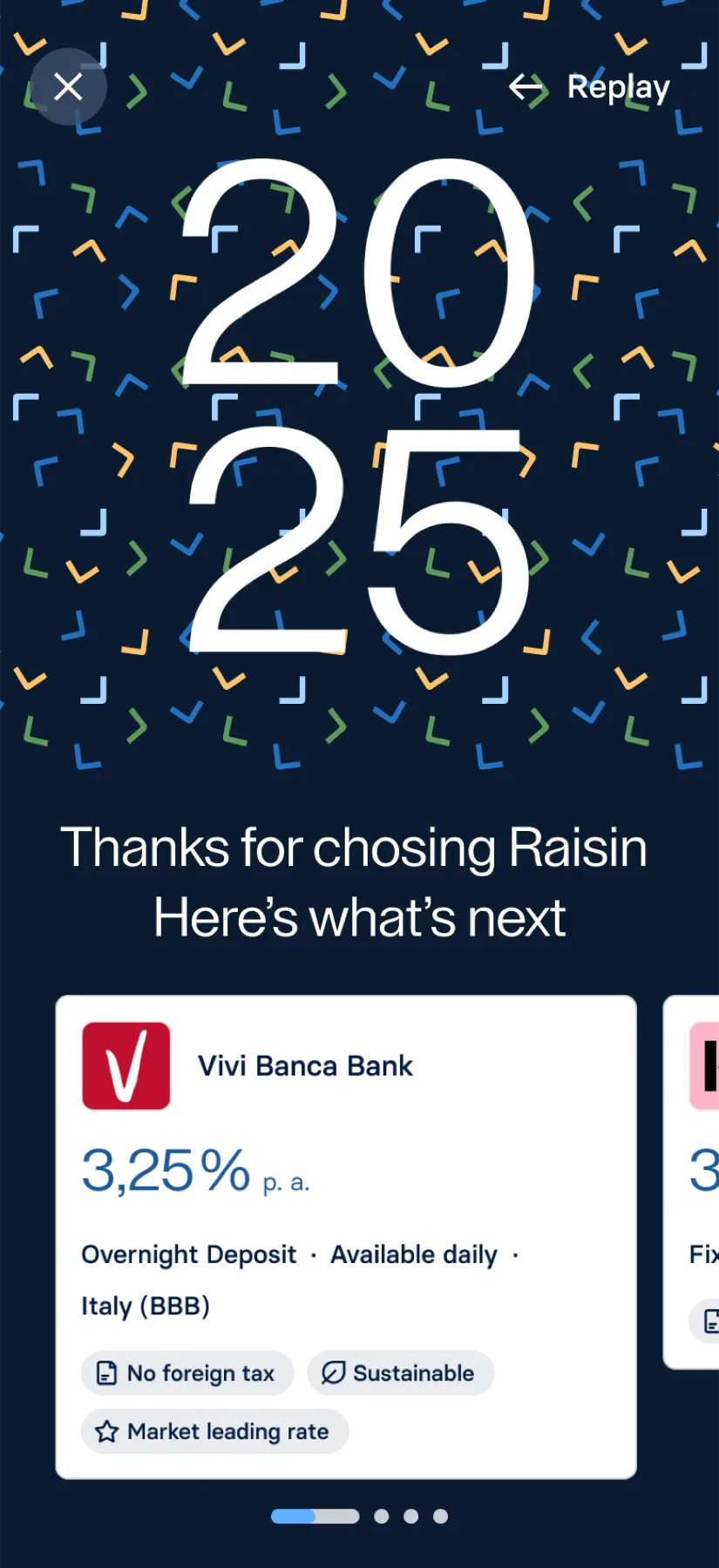
Year-in-review for savers — design-initiated, no PM brief.
Atomic email system — transactional and marketing, Bloomreach-ready.
Impact: Master-template concept · spans every marketing & transactional use case.
Figma Ways of Working
Principles of Prototyping
Enablement
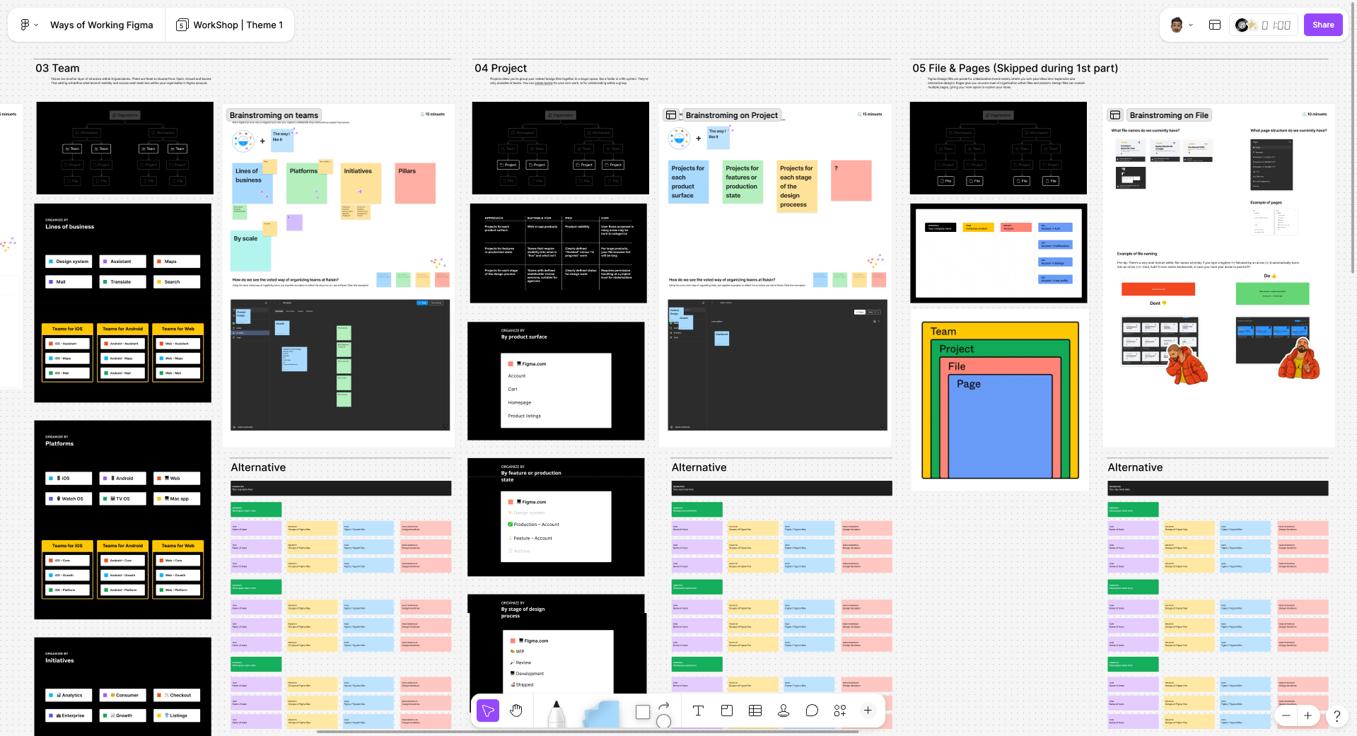
Two team standards: Figma Ways of Working + Principles of Prototyping.
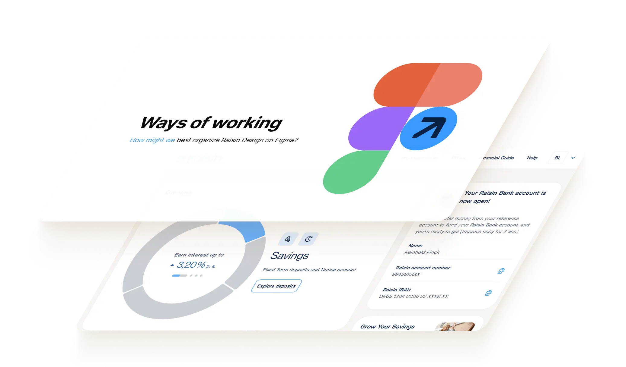
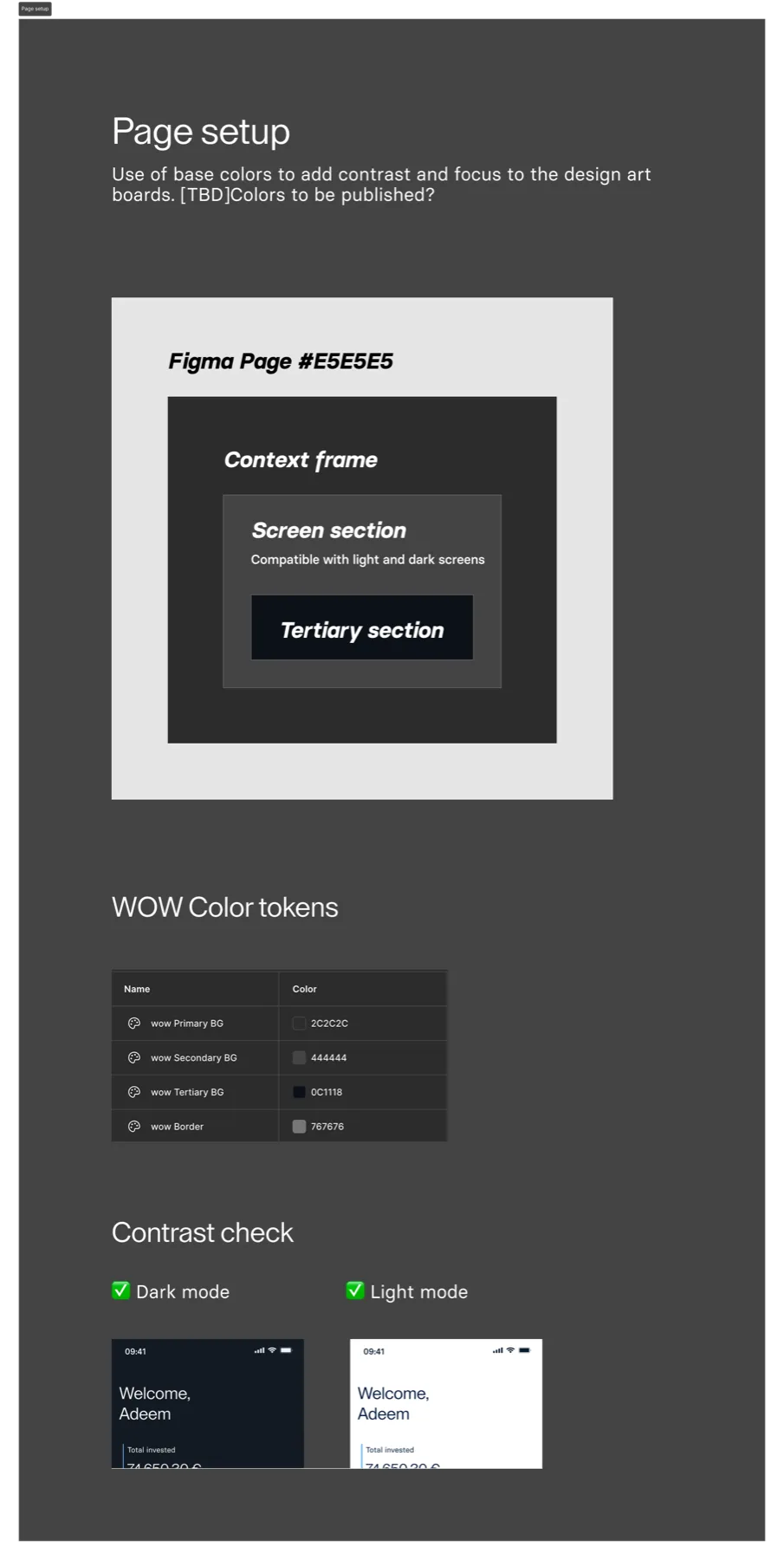
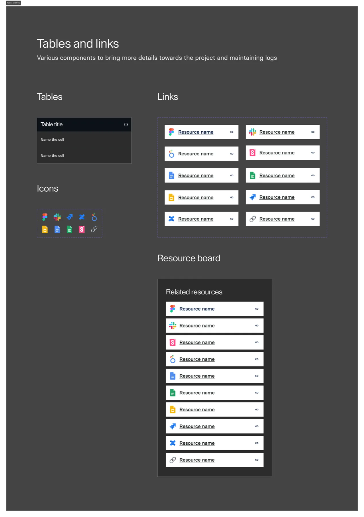
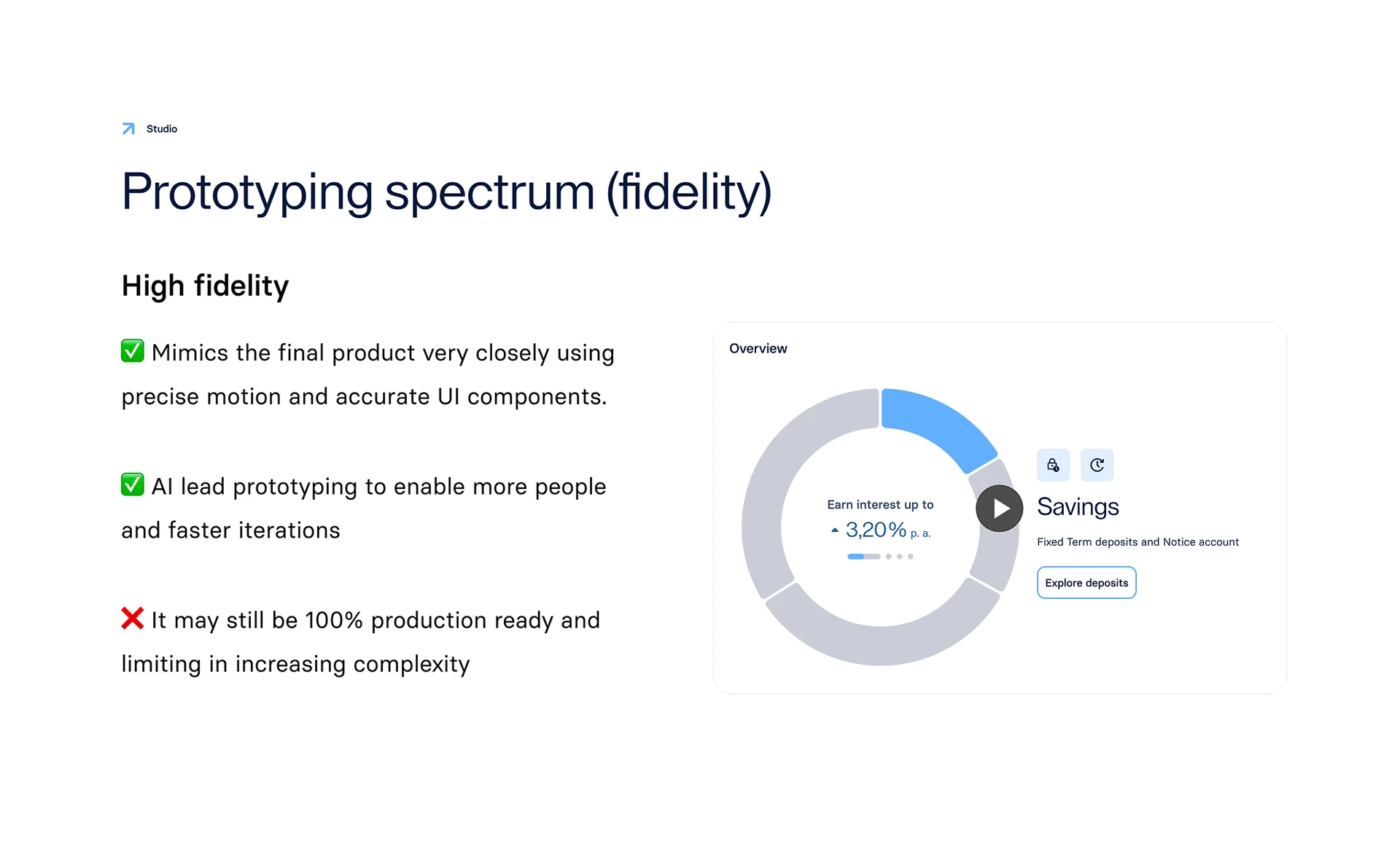
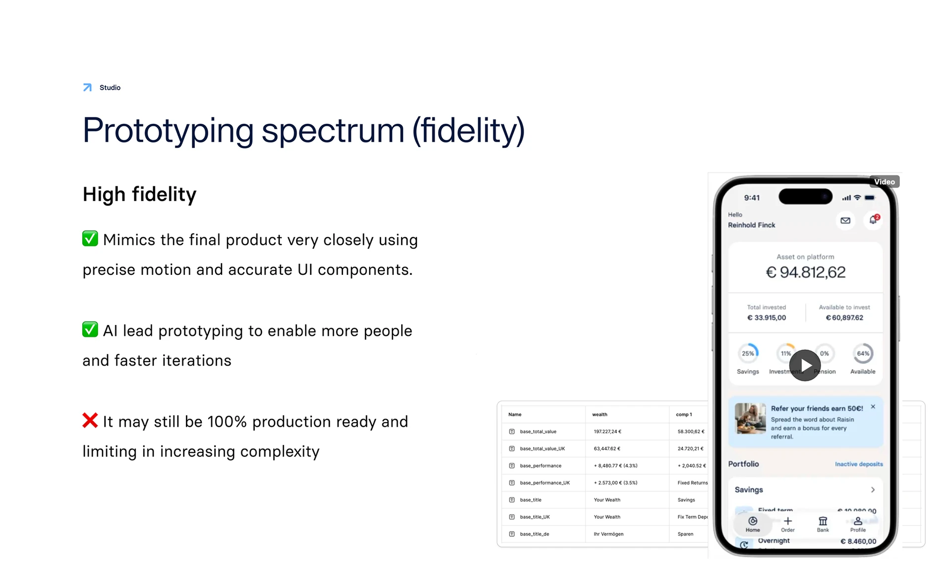
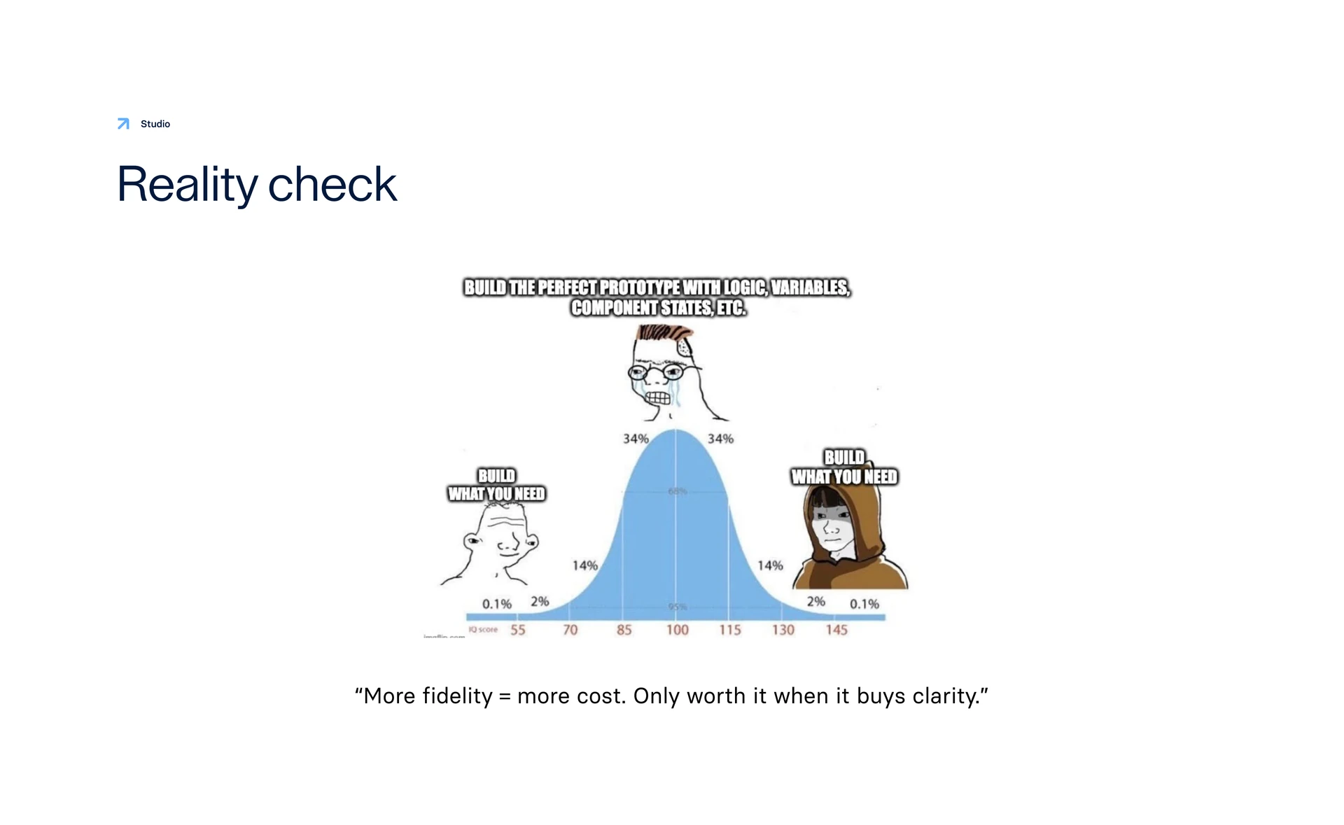
Every project restarted file structure; every prototype landed at a different fidelity. Figma Ways of Working standardised the files. Principles of Prototyping standardised the conversation — what to build, at what fidelity, and why.
WoW: adopted team standard · still how every project starts
PoP: shared language for prototype fidelity · still how we critique
Research · operating model
Wealth Hub proved the value. The team still needed a way to run the next study.
User studies had been rare and German-only. Wealth Hub changed that — multi-market interviews, synthesis, stakeholder alignment. The MVP launch survey showed structured feedback at scale. I authored the research operating model: when to use interviews vs surveys, how participants are recruited through Bloomreach, hypothesis-first briefs, synthesis in Miro, and the compliance layer so legal and markets could sign off once, not per study.
Mobile stalled after the tribe split. Desk research → prototype → Maze → ship — plus Cura, the horizon.
The tribe split in two, the mobile redesign had stalled for months, and nobody had written down where the product was going. I took mobile end-to-end — desk research, in-flow prototyping, Maze validation, Cura vision — and raised the team's prototyping bar.
I led mobile IA + Maze validation. I built the in-flow prototype with One Data. Shipping now.
Desk research
Read the stall before redesigning.
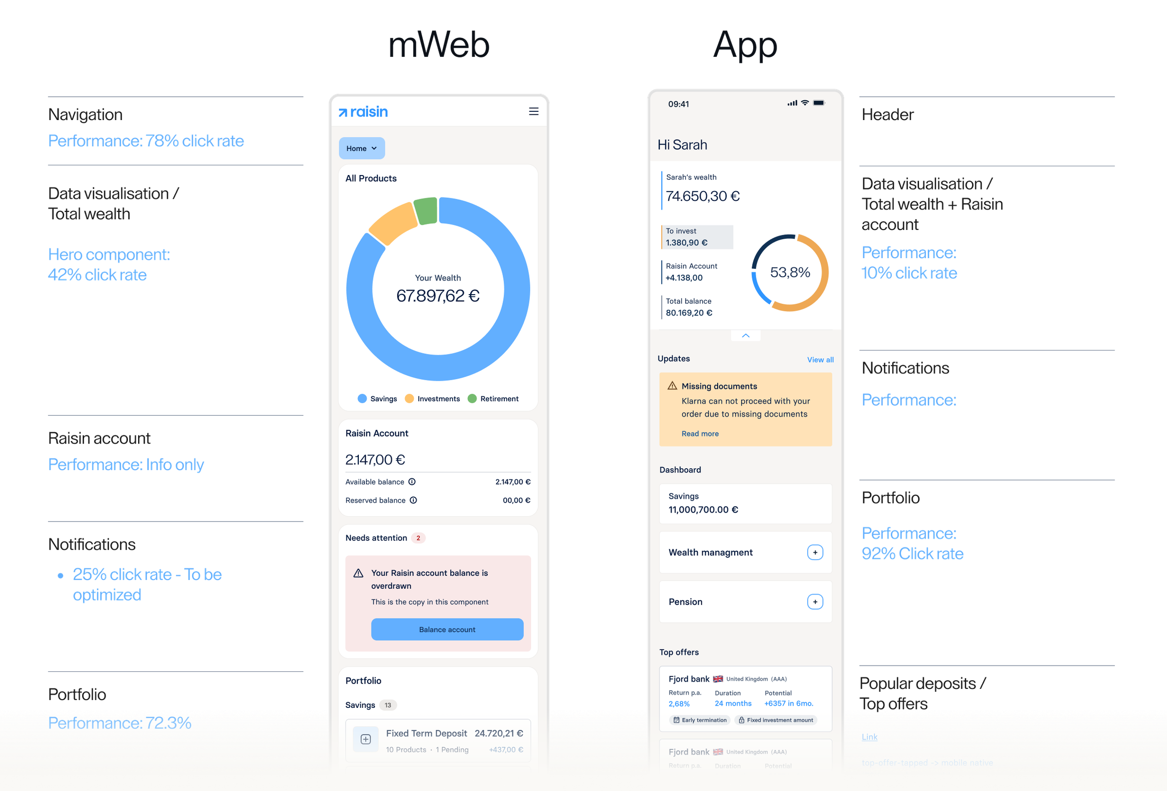
Legacy mobile: 42% / 25% / 33% interaction split — no pattern worth copying from web.
Web Wealth Hub earned its structure through customer research. Mobile didn’t have that yet — only a stalled redesign and pressure to copy across. Desk research on legacy interaction patterns (42% / 25% / 33%) showed why that shortcut failed: real usage didn’t match web’s model, and no single mobile pattern had won.
Legacy mobile · interaction data · pre-ideation baseline
Web ↔ mobile parity
Re-ground, don't restart.
Inherit the Wealth Hub system. Redesign the mobile surface — don’t redo twelve markets of research.
Web had earned its structure through research and shipped across 12 markets. Mobile’s job wasn’t to repeat that work — it was to translate it. After desk research ruled out replication, I aligned the tribe on a simple rule: inherit the Wealth Hub concept and system, redesign the mobile surface. That unblocked ideation without discarding what was already validated.
Inherited: hierarchy + colour system · Redesigned: tabs + Home
Mobile · ideate
Two concepts for the mobile home dashboard.
Grounded in the mobile dashboard study brief: asset-on-platform clarity, Portfolio for owned products, and legible primary sections. Neither concept was pre-selected — both went into validation as Hypothesis A and B.
Concept validation · Hypothesis A vs B
A · Tabbed IA
Overview split across tabs — customers hop between sections to build the picture
B · Portfolio-card home
Total assets and performance on landing — products and detail one level in
Two clickable prototypes — same wealth jobs, different home structure
New mobile IA · asset on platform · insight on Home
Four tabs, one visual idea
Four tabs — Overview, Portfolio, Products, Wallet. One Data wired into a live prototype.
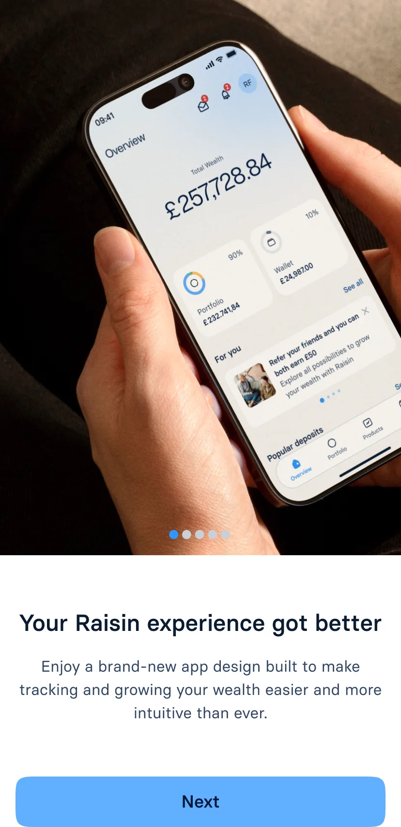
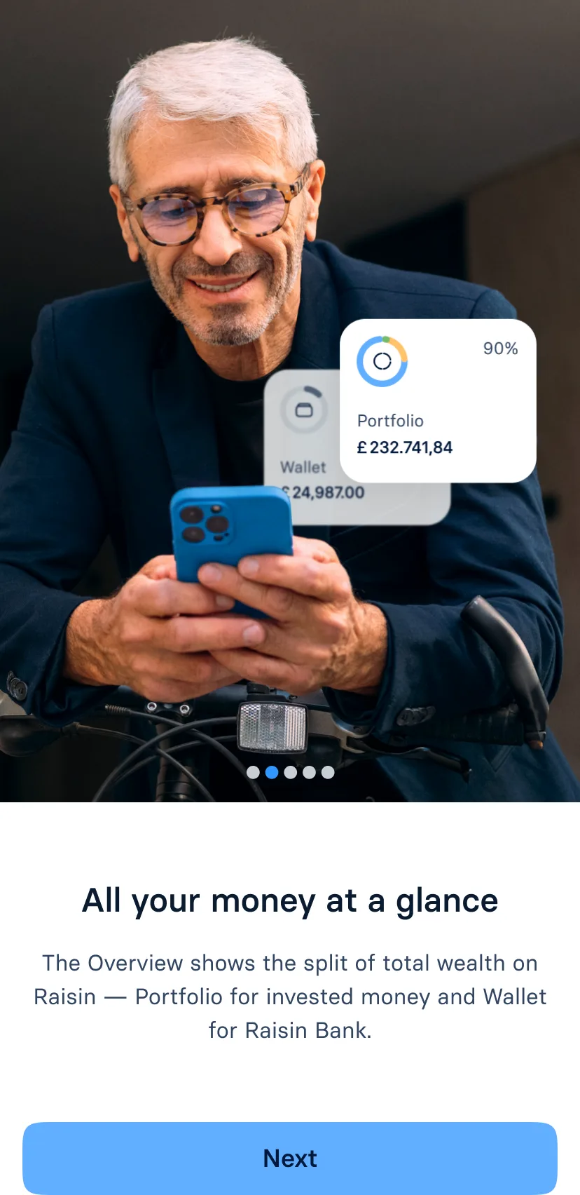
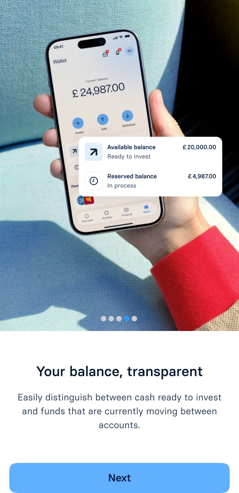
Overview, Portfolio, Products, and Wallet — parity with the web Wealth Hub. Home surfaces total assets and performance; Portfolio holds active products. I wired One Data personas into a live prototype so reviews ran on realistic mobile, not flat mocks.
Key trade-off · insight
A · Standalone analytics tab
Dedicated performance surface, separate from holdings
B · Embedded insight
Total assets + performance on Home; owned products on Portfolio
Position: Thin analytics as a primary tab erodes trust on mobile — show wealth and performance where people land; put active holdings on Portfolio.
Working prototype — tabs, search, realistic One Data personas
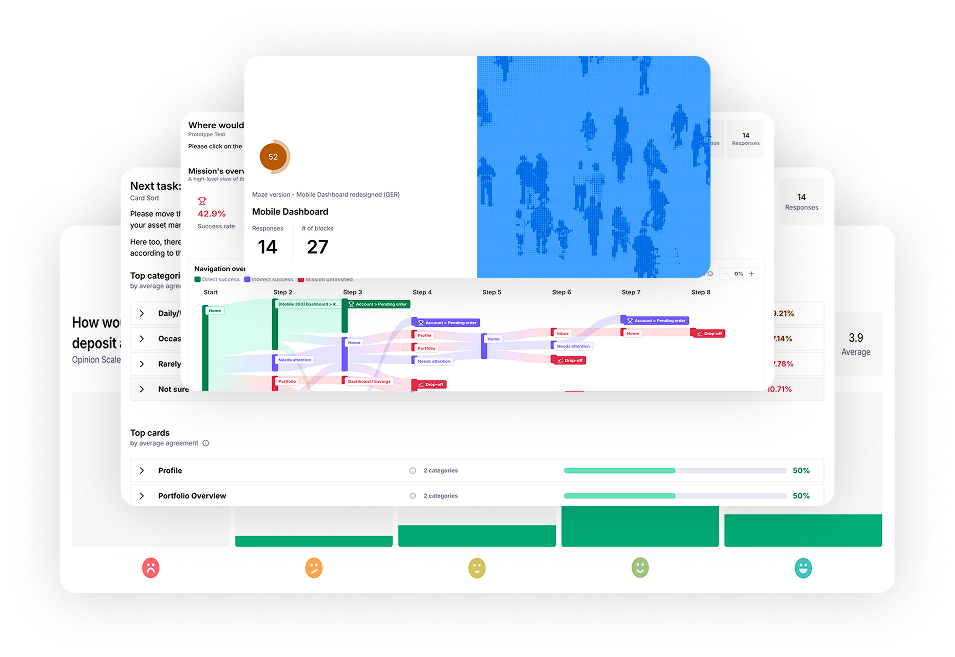
Maze validation · Unmoderated study · Two-week
Pressure-test the IA
Tabbed IA won — 92.9% vs 71.4% task success. Open risk: pending products (42.9%).
Two-week unmoderated study on the live prototype — portfolio-card vs tabbed IA. Research goal: confirm asset-on-platform Home improves wealth clarity, the Portfolio tab still works for owned products, and primary sections stay legible. Portfolio-card won — 92.9% task success vs 71.4%. Open risk: locating pending products 42.9%.
Shipped · mobile dashboard
A clearer mental model for wealth on mobile.
12 B2C markets · four-tab IA · light and dark
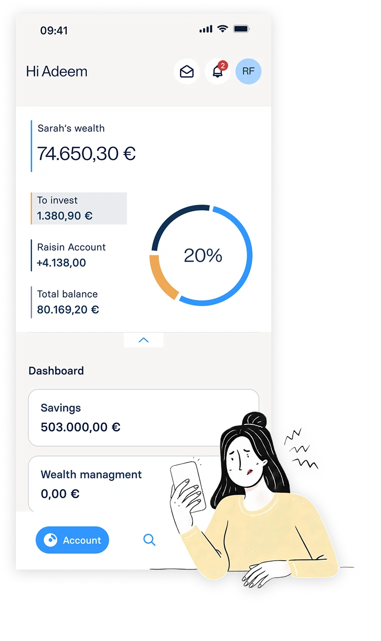
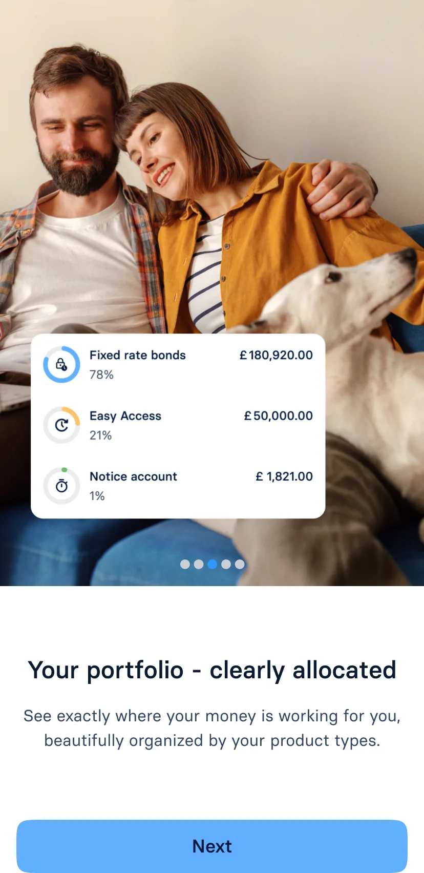
Beyond a visual refresh: clearer holdings, performance, and next steps across Overview, Portfolio, Products, and Wallet. Same Wealth Hub spine from web and Maze validation — rolling out market by market.
Early App Store signal backs the structure — reviewers call out overview and clarity before polish.
Maze-validated · shipping now · early reviews 5/5
74%
Adoption target · 4 months post-launch
+9%
Active customers per week
+26% / +11%
Starting an order & successful top-up · per 100 active customers
~€85bn
AuM increase by H1 2026
“Clear and easy to overview — everything in one place.”
“Easy to invest and move money between products and my linked account — best way to stay in control of savings.”
Design vision · VP mandate · I authored the narrative
Design vision for where Raisin must evolve.
VP initiated the vision exercise. I owned the work inside it — Gather, Envision, Plan — and authored the 8-slide Cura deck: from reporting the past to helping savers decide next.
Gather → Envision → Plan · 8-slide narrative authored solo
04
Design org1 of 4 AI ChampionsEnablement
Design × AI
Workshop to 180-day plan. Four production tools, eight designers coached — Showcase + Clinic until it stuck.
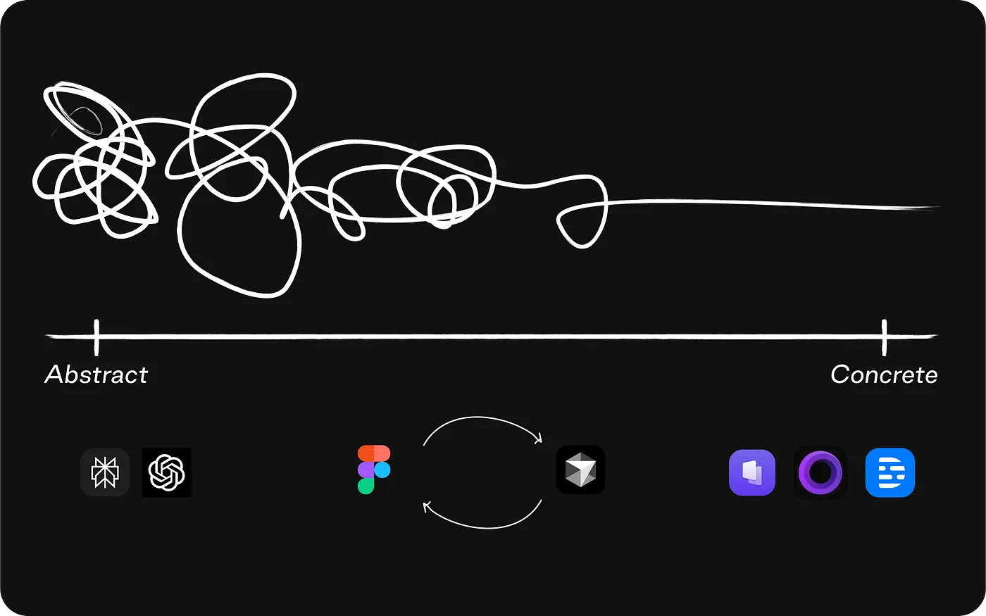
What started as a prototyping workshop became design's 180-day operating plan. As one of four org-wide AI Champions, I built four tools for daily production use, championed the operating plan, and led Showcase and Clinic until the workflows stuck.
I built the toolkit. We ran the programme; I championed design's slice.
Origin
A 180-day programme to match engineering velocity.
One of four Champions — Lab, Showcase, Clinic, 180 days.
VP launched org-wide AI enablement. As one of four AI Champions, I wrote design's operating plan and ran adoption — Lab kick-start, weekly Showcase demos, and Clinic office hours I led. Coached eight designers on Cursor foundations first, then autonomy on live work; the programme was mostly coaching, the toolkit supported it.
1 of 4 AI Champions · Kick-start Lab → Showcase + Clinic · 180 days
Design × Cursor toolkit
Established an infrastructure every designer could run.
Setup
Install Cursor, connect Figma MCP, and Git basics to get a repo running.
Rules
Shared .cursorrules — tokens, typography, accessibility, and One Data on every prompt.
Skills
Repeatable pipelines — design QA, annotate, and variant workflows.
Subagents
Specialist modes — component architect, design systems, state and theme sync.
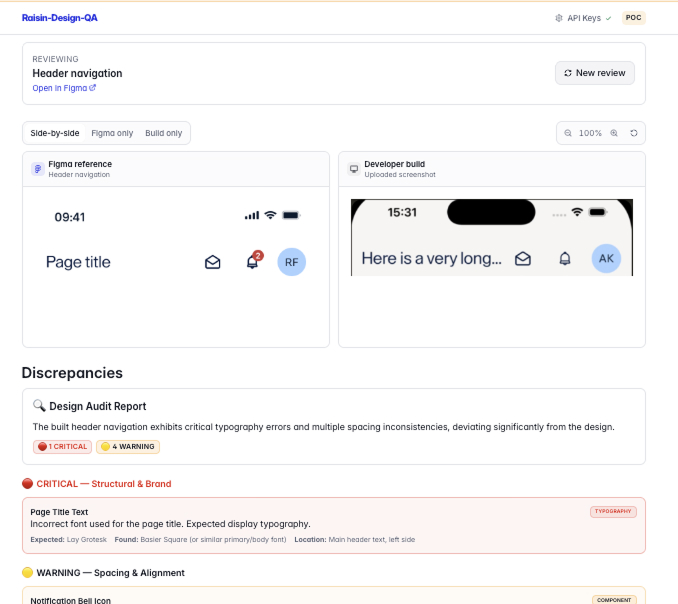
Design QA, copy, typography, annotation — four tools in daily production.
A structured build sprint — Design QA, copywriting, typography, and prototype annotation — all in production use.
Design QA — Figma link + developed screen to catch visual drift
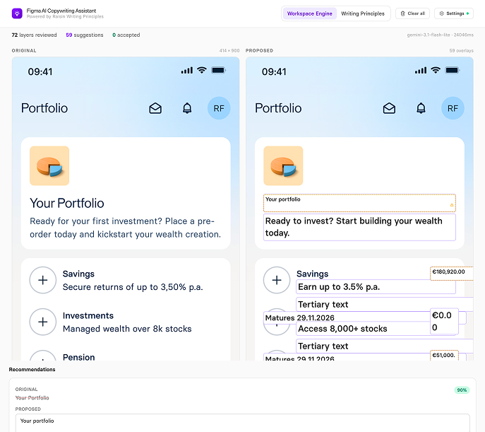
Copywriting — Raisin voice from a Figma link; suggests copy and replaces it in place
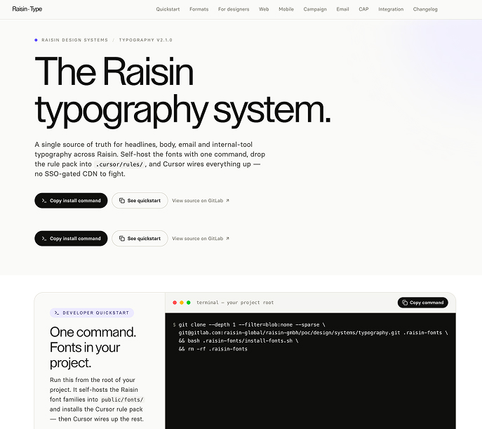
Typography system — prototype safely with Raisin premium fonts
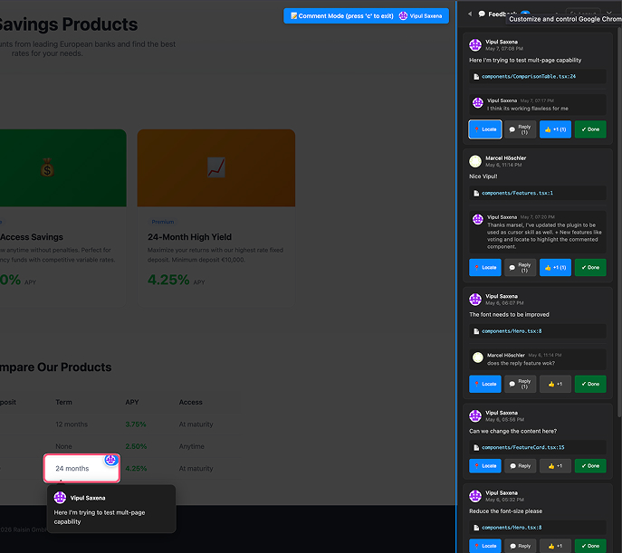
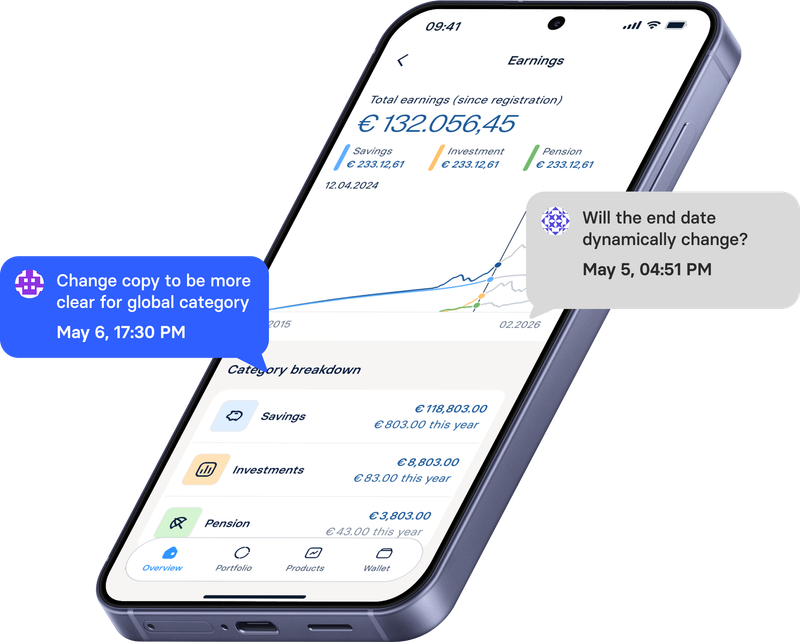
Annotation — stakeholder comments on prototypes, synced as GitLab issues
Coaching · applied
Coached 8 designers on Cursor.
Eight designers — Cursor foundations to shipping on live work.
Coached eight designers from Cursor foundations to autonomy on live work — setup, prompts, reviews, and shipping. One example: a cumulative earnings exploration with Deposits, vibe-coded in the open. The feedback-loop plugin made reviews native — Figma-style comments on the prototype (press c), synced as GitLab issues with file and line metadata, so PM notes landed on the exact line of code in Cursor.
8 designers · foundations → live work
Cadence
Clinic
Weekly clinic calls
Open to join — drop in, unblock, and go.
Monorepo
Monorepo
Designers pushing MRs for UI fixes through Storybook.
Registry
Tools & skills registry
Registry admin — kept the live catalogue current as we shipped.
Workflow
AI workflow
Evangelized AI workflows and kept documentation alive for the team.
Proof
What it produced — measured honestly, market by market.
Some moved. Some didn't. I measured both.
Some numbers moved (NPS, task success, loyalty). Some didn't: zero-state — no conversion lift; Wrapped — soft AuM, not significant. I measured both.
Practice
Web and mobile — customer outcomes.
Practice
Web Wealth Hub · 12 B2C markets
80%
Adoption target · 3 months post-launch · Met
87%
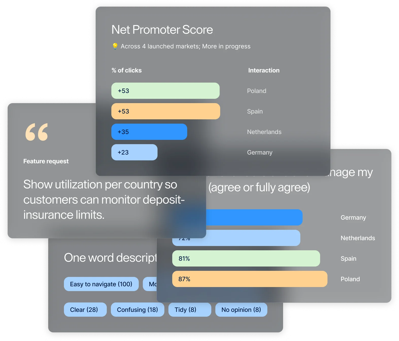
Better understand their wealth (PL 87 · ES 81 · DE 73 · NL 72)
Starting an order & successful top-up · per 100 active customers
~€85bn
AuM increase by H1 2026
Enablement
Team capability.
Enablement
0 faster
Ticket closure 10d → 7d · 60–70% automatable-work diagnosis · 4 tools in daily production
0 designers
Coached 1:1 on AI workflows — foundations first, then autonomy on live work
0 playbooks
Design critique, ways of working, product semantics, and the research operating model — all still in use
Hiring panel
Director of Design and +1 Product Designer hiring — interviews, product case, final hire decision
VP of Design —"Vipul was a key voice in our Director of Design hiring process — from structured interview feedback through the product case to the final hire decision."VP of Design —"Clear spikes of excellence in innovation, peer leadership, and technological adaptability — a pioneer in integrating AI into our design workflows."Head of Product —"Pragmatic yet aspirational — his domain depth across app, web, and markets helps us deliver faster and at higher quality."Director of Product —"He grabbed the complete requirement and came up with his own idea and research — widely accepted, green light on the spot."Chief of AI —"Got into AI early and pulled the design team into Cursor with him — proactively generates ideas and confidently articulates design rationale."VP of Design —"Vipul was a key voice in our Director of Design hiring process — from structured interview feedback through the product case to the final hire decision."VP of Design —"Clear spikes of excellence in innovation, peer leadership, and technological adaptability — a pioneer in integrating AI into our design workflows."Head of Product —"Pragmatic yet aspirational — his domain depth across app, web, and markets helps us deliver faster and at higher quality."Director of Product —"He grabbed the complete requirement and came up with his own idea and research — widely accepted, green light on the spot."Chief of AI —"Got into AI early and pulled the design team into Cursor with him — proactively generates ideas and confidently articulates design rationale."
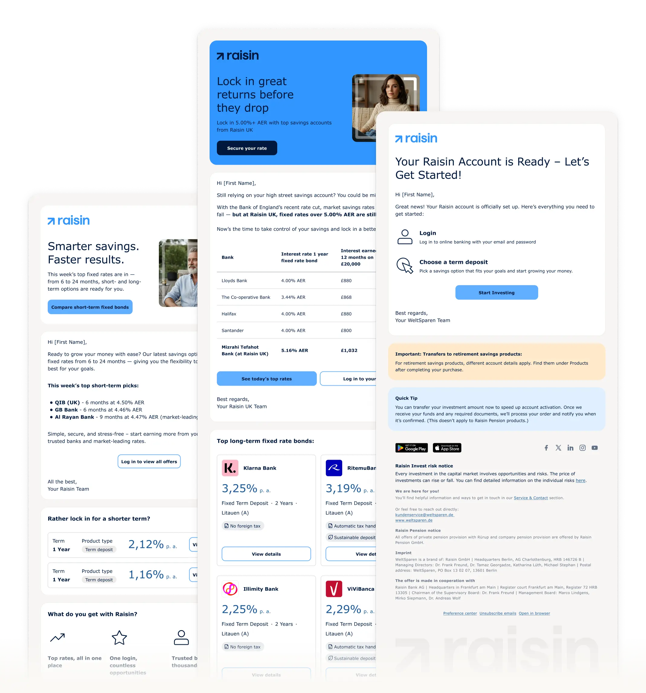
The brand, built out
From static guidelines to a living system — across every touchpoint customers actually use.